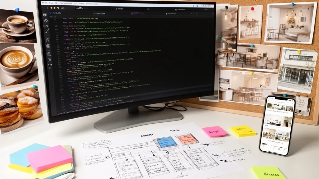
Building Your Site's Content
with HTML
We'll take the skeleton from last time and fill it with images, text, and menu details to complete the full HTML for café SOEL. By the end of this part, every piece of content will be in place.
Quick Recap
- Learned HTML's three-layer structure (html → head → body)
- Used semantic tags (header, nav, main, section, footer) and understood their meaning
- Built the café SOEL skeleton with headings and plain text only
If the code from last time is showing in your browser and the in-page navigation links are working, you're all set to move forward.
Goals for This Part
- Display images with <img> and write proper alt attributes
- Understand the class attribute and add class names in preparation for CSS
- Fill every section of café SOEL with content and finish the HTML
See the Part 3 result →
Since we haven't added any CSS yet, images will display at their original size and text will appear in the browser's default style. Things will look rough around the edges, but today we finish the HTML "contents." Once that's in place, CSS will transform the appearance starting next time — so there's a lot to look forward to.
New HTML Elements We'll Use Today
Last time we built the "skeleton" of the site. Today we're filling in the "contents." That means introducing a handful of new HTML elements. I'll walk through each one as we write the code, but let's get the big picture first.
<img> displays images on the page. We'll use it for photos and the logo.
<div> and <span> are generic grouping elements with no inherent meaning. We use them when we need a "wrapper" to apply CSS styles to.
<article> represents a self-contained piece of content. It's perfect for something like a menu card that makes sense on its own.
<dl>, <dt>, and <dd> make up a description list — ideal for "label and value" pairs like shop details.
And finally, the class attribute. This lets us attach a "name tag" to any element, which we'll use to target it with CSS in later parts.
Displaying Images — The <img> Element
To show an image on a web page, we use the <img> element. This is where the image files you downloaded in Part 1 come into play. Make sure the files are sitting inside your img folder.
<img src="img/hero.jpg" alt="The interior of café SOEL" width="1920" height="1080">The src attribute is the path to the image file. img/hero.jpg means "the file hero.jpg inside the img folder." We write it as a relative path from index.html.
The alt attribute provides "alternative text" — a short description of the image. It's used when the image can't be displayed or when a screen reader reads the page aloud.
width and height tell the browser the image's original dimensions in pixels. This lets the browser reserve the right amount of space before the image loads, preventing that annoying page jump (called "layout shift") when the picture finally appears.
Notice that <img> has no closing tag. It's written as just <img ... > and is complete by itself — what we call a "void element."
The class Attribute — Name Tags for CSS
In our skeleton code from last time, we didn't use the class attribute. From this point on, we'll be adding them generously.
A class attribute gives an HTML element a "name." That name becomes a target — a marker — that CSS can use to apply styles in future parts.
<section class="hero">
  <!-- Hero section contents -->
</section>
Remember, an id attribute can only be used once per page. A class, on the other hand, can be reused as many times as you like. For example, you can give all four menu cards the same class="menu-card".
There's no strict naming rule, but the guideline is simple: make the name describe what the element is. Avoid names like box1 or red-text. Instead, choose meaningful names like hero-content or menu-card-title.
Name your classes after what an element does, not how it looks. That one habit will make your code far easier to read six months from now.
<div> and <span> — Meaningless Wrappers
Last time I emphasized using semantic tags. But sometimes no semantic tag fits the situation. That's when <div> and <span> come in.
<div> is a block-level grouping element. Use it when you need to bundle several elements into a single box — for instance, wrapping an image and text together so you can lay them out side by side later.
<span> is an inline grouping element. Use it when you want to target just a portion of text with a style.
The key point is that neither of them carries any meaning. Unlike <header> or <nav>, they don't describe the structure of your content. They're purely "grouping containers for CSS."
Let's Start Rewriting
Time to replace our skeleton code with real content. Open index.html and we'll update it section by section.
The <head> stays mostly the same. We're changing the contents of <body>. But first, let's make one small tweak to the <title>.
<title>café SOEL — そよぐ光と、ひと息つくひととき</title>We've added the café's tagline to the title. Now when people see this page in browser tabs or search results, they'll get a feel for the brand right away.
Upgrading the Header
Our header from last time was plain text. Now we'll swap in the image logo, add class attributes, and include an aria-label.
  <header class="header" id="top">
    <div class="header-inner">
      <a href="#top" class="logo">
        <img src="img/logo.png" alt="café SOEL" width="160" height="40">
      </a>
      <nav aria-label="Main navigation">
        <ul class="nav-list">
          <li><a href="#concept" class="nav-link">Concept</a></li>
          <li><a href="#menu" class="nav-link">Menu</a></li>
          <li><a href="#gallery" class="nav-link">Gallery</a></li>
          <li><a href="#access" class="nav-link">Access</a></li>
        </ul>
      </nav>
    </div>
  </header>
Let's walk through the changes. The plain text "café SOEL" has been replaced with an <img> element — a proper image logo. The alt="café SOEL" ensures the site name is still accessible as text.
We've wrapped the logo and nav in <div class="header-inner">. This wrapper is preparation for Part 5, where we'll use Flexbox to arrange them side by side.
aria-label="Main navigation" tells screen readers the name of this navigation. When a page has more than one nav (header and footer, for example), this label helps users tell them apart.
Every element now has a class attribute: header, header-inner, logo, nav-list, nav-link. Each one will become a CSS target later on.
Rewriting the Hero Section
Let's add the main visual image and give this section some proper structure.
<section class="hero" id="hero">
<div class="hero-image">
<img src="img/hero.jpg" alt="café SOELの店内。大きな窓から自然光が差し込む開放的な空間" width="1920" height="1080">
</div>
<div class="hero-content">
<p class="hero-sub">Natural Light & Coffee</p>
<h1 class="hero-title">そよぐ光と、<br>ひと息つくひととき。</h1>
<a href="#concept" class="hero-cta">Scroll</a>
</div>
</section>We've placed hero.jpg as the main visual. Notice how the alt text specifically describes what's in the image rather than just saying "hero image."
The <br> tag creates a line break within text. Here it splits the tagline across two lines. Remember, <br> is for visual line breaks within a single thought — not for separating paragraphs.
The "Scroll" link points to the concept section via an in-page link. Once we style it with CSS, it'll become the scroll button you see in the finished design.
Rewriting the Concept Section
Let's add an image and a richer text structure to the concept section.
    <section class="concept section" id="concept">
      <div class="concept-inner">
        <div class="concept-image">
          <img src="img/concept.jpg" alt="木のテーブルの上に置かれたハンドドリップコーヒーと陶器のカップ" width="1200" height="800">
        </div>
        <div class="concept-text">
          <span class="section-label">Concept</span>
          <h2 class="section-heading">ひかりと、木と、<br>一杯のコーヒーと。</h2>
          <p>café SOEL(カフェ ソエル)は、「そよぐ光」をイメージした造語から名づけました。</p>
          <p>大きな窓から差し込む自然光、ナチュラルな木のぬくもり、丁寧に淹れた一杯のコーヒー。忙しい日常からすこしだけ離れて、穏やかな時間を過ごしていただける場所でありたいと思っています。</p>
          <p>素材の味を大切にしたフードとドリンクを、心を込めてお届けします。</p>
        </div>
      </div>
    </section>
See class="concept section"? You can give a single element multiple classes by separating them with a space. The section class will handle shared spacing, while the concept class will target styles unique to this section.
<span class="section-label"> is a small label that will display "Concept" above the heading. Since <span> is an inline element, it doesn't disrupt the flow of content.
The concept-inner wrapper groups the image and text together. It looks like nothing special right now, but in Part 5 we'll use Flexbox to lay them out side by side. We're planting the structural seeds now so that CSS can do its work later.
The Menu Section — Using <article>
The menu section features four menu cards. This is where we introduce the <article> element.
<article> represents a self-contained piece of content. If you could take it out of the page and it would still make sense on its own, <article> is the right choice. A menu card — with its image, name, description, and price — fits that description perfectly.
    <section class="menu section" id="menu">
      <div class="section-header">
        <span class="section-label">Menu</span>
        <h2 class="section-heading">こだわりのメニュー</h2>
        <p class="section-desc">素材を活かしたシンプルなおいしさを、丁寧にお届けします。</p>
      </div>
      <div class="menu-grid">
        <article class="menu-card">
          <div class="menu-card-image">
            <img src="img/menu-coffee.jpg" alt="ハンドドリップで淹れたコーヒー" width="800" height="800">
          </div>
          <div class="menu-card-body">
            <h3 class="menu-card-title">Hand Drip Coffee</h3>
            <p class="menu-card-desc">産地ごとに異なる豆の個性を引き出す、一杯ずつ丁寧なハンドドリップ。</p>
            <span class="menu-card-price">¥550</span>
          </div>
        </article>
        <article class="menu-card">
          <div class="menu-card-image">
            <img src="img/menu-latte.jpg" alt="シンプルなラテアートが施されたカフェラテ" width="800" height="800">
          </div>
          <div class="menu-card-body">
            <h3 class="menu-card-title">Café Latte</h3>
            <p class="menu-card-desc">まろやかなミルクとエスプレッソのバランス。シンプルなラテアートを添えて。</p>
            <span class="menu-card-price">¥600</span>
          </div>
        </article>
        <article class="menu-card">
          <div class="menu-card-image">
            <img src="img/menu-cake.jpg" alt="素朴で美しいケーキ" width="800" height="800">
          </div>
          <div class="menu-card-body">
            <h3 class="menu-card-title">Seasonal Cake</h3>
            <p class="menu-card-desc">季節のフルーツを使った、素朴だけど美しいケーキ。コーヒーとの相性も抜群です。</p>
            <span class="menu-card-price">¥650</span>
          </div>
        </article>
        <article class="menu-card">
          <div class="menu-card-image">
            <img src="img/menu-sandwich.jpg" alt="断面が美しいサンドイッチ" width="800" height="800">
          </div>
          <div class="menu-card-body">
            <h3 class="menu-card-title">SOEL Sandwich</h3>
            <p class="menu-card-desc">新鮮な野菜とハム、自家製ソースをはさんだボリュームのあるサンドイッチ。</p>
            <span class="menu-card-price">¥900</span>
          </div>
        </article>
      </div>
    </section>
That's a lot of code, but the structure is straightforward. There's a section-header (the heading area) and a menu-grid (a container holding the four cards). Inside menu-grid, four article.menu-card elements sit in a row.
Notice that each card's title uses <h3>. The heading hierarchy across the page is "h1 (main tagline) → h2 (section headings) → h3 (card titles)." The levels are kept in proper order.
Rewriting the Gallery Section
    <section class="gallery section" id="gallery">
      <div class="section-header">
        <span class="section-label">Gallery</span>
        <h2 class="section-heading">店内の様子</h2>
        <p class="section-desc">自然光と木のぬくもりに包まれた、穏やかな空間。</p>
      </div>
      <div class="gallery-grid">
        <div class="gallery-item gallery-item--large">
          <img src="img/interior-01.jpg" alt="大きな窓から光が差し込む窓際の席" width="1200" height="800">
        </div>
        <div class="gallery-item">
          <img src="img/interior-02.jpg" alt="木のカウンターとペンダントライト" width="1200" height="800">
        </div>
        <div class="gallery-item">
          <img src="img/exterior.jpg" alt="白い外壁と黒フレームの窓が特徴的な外観" width="1600" height="1000">
        </div>
      </div>
    </section>
Take a look at the class name gallery-item--large. The double hyphen (--) signals a "variation" — a naming convention that marks the first photo for a larger display. We'll use this class in Part 6 when we build the layout with CSS Grid.
The Access Section — Using the <dl> Description List
The shop information is made up of "label → value" pairs: address, hours, closing day, and so on. A structure like this is a perfect fit for <dl> (description list).
<dl> wraps the entire list. <dt> is the label (term), and <dd> is the value (description). In HTML5, it's also valid to wrap each <dt>/<dd> pair inside a <div>.
    <section class="access section" id="access">
      <div class="access-inner">
        <div class="access-image">
          <img src="img/exterior.jpg" alt="café SOELの外観" width="1600" height="1000">
        </div>
        <div class="access-info">
          <span class="section-label">Access</span>
          <h2 class="section-heading">店舗情報</h2>
          <dl class="info-list">
            <div class="info-item">
              <dt>住所</dt>
              <dd>〒156-0054 東京都世田谷区桜丘町3-12-8</dd>
            </div>
            <div class="info-item">
              <dt>営業時間</dt>
              <dd>
                平日 10:00 – 19:00<br>
                土日 9:00 – 19:00
              </dd>
            </div>
            <div class="info-item">
              <dt>定休日</dt>
              <dd>毎週水曜日</dd>
            </div>
            <div class="info-item">
              <dt>電話</dt>
              <dd><a href="tel:03-0000-0000">03-0000-0000</a></dd>
            </div>
            <div class="info-item">
              <dt>アクセス</dt>
              <dd>小田急線 千歳船橋駅より徒歩8分</dd>
            </div>
          </dl>
        </div>
      </div>
    </section>
Notice the phone number link: href="tel:03-0000-0000". The tel: prefix creates a link that triggers a phone call when tapped on a smartphone. It's a standard pattern for real-world business websites.
Rewriting the Footer
<footer class="footer">
<div class="footer-inner">
<a href="#top" class="footer-logo">
<img src="img/logo.png" alt="café SOEL" width="120" height="30">
</a>
<ul class="footer-nav">
<li><a href="#concept">Concept</a></li>
<li><a href="#menu">Menu</a></li>
<li><a href="#gallery">Gallery</a></li>
<li><a href="#access">Access</a></li>
</ul>
<p class="footer-copy">© 2025 café SOEL. All rights reserved.</p>
</div>
</footer>The footer now has a logo, navigation links, and a copyright notice. The logo is smaller here (width="120") than in the header, because the footer plays a supporting role. Small sizing details like this will be refined further with CSS.
Checking the Full Picture
Every section is now in place. Save your file and check it in the browser.
See the Part 3 result →
Without CSS, you'll see text and images stacked vertically in a plain column. The images may look huge since they're displaying at full size. But that's exactly how it should be. HTML is a language for building structure — the visual polish comes next when we introduce CSS. Does your screen match what you see in the preview?
If something looks off, or if images aren't showing, check the following.
Here's the complete index.html at this point. If you got stuck anywhere along the way, you can copy this entire block and paste it into your file.
<!DOCTYPE html>
<html lang="ja">
<head>
<meta charset="UTF-8">
<meta name="viewport" content="width=device-width, initial-scale=1.0">
<title>café SOEL — そよぐ光と、ひと息つくひととき</title>
</head>
<body>
<!-- ========== HEADER ========== -->
<header class="header" id="top">
<div class="header-inner">
<a href="#top" class="logo">
<img src="img/logo.png" alt="café SOEL" width="160" height="40">
</a>
<nav aria-label="メインナビゲーション">
<ul class="nav-list">
<li><a href="#concept" class="nav-link">Concept</a></li>
<li><a href="#menu" class="nav-link">Menu</a></li>
<li><a href="#gallery" class="nav-link">Gallery</a></li>
<li><a href="#access" class="nav-link">Access</a></li>
</ul>
</nav>
</div>
</header>
<main>
<!-- ========== HERO ========== -->
<section class="hero" id="hero">
<div class="hero-image">
<img src="img/hero.jpg" alt="café SOELの店内。大きな窓から自然光が差し込む開放的な空間" width="1920" height="1080">
</div>
<div class="hero-content">
<p class="hero-sub">Natural Light & Coffee</p>
<h1 class="hero-title">そよぐ光と、<br>ひと息つくひととき。</h1>
<a href="#concept" class="hero-cta">Scroll</a>
</div>
</section>
<!-- ========== CONCEPT ========== -->
<section class="concept section" id="concept">
<div class="concept-inner">
<div class="concept-image">
<img src="img/concept.jpg" alt="木のテーブルの上に置かれたハンドドリップコーヒーと陶器のカップ" width="1200" height="800">
</div>
<div class="concept-text">
<span class="section-label">Concept</span>
<h2 class="section-heading">ひかりと、木と、<br>一杯のコーヒーと。</h2>
<p>café SOEL(カフェ ソエル)は、「そよぐ光」をイメージした造語から名づけました。</p>
<p>大きな窓から差し込む自然光、ナチュラルな木のぬくもり、丁寧に淹れた一杯のコーヒー。忙しい日常からすこしだけ離れて、穏やかな時間を過ごしていただける場所でありたいと思っています。</p>
<p>素材の味を大切にしたフードとドリンクを、心を込めてお届けします。</p>
</div>
</div>
</section>
<!-- ========== MENU ========== -->
<section class="menu section" id="menu">
<div class="section-header">
<span class="section-label">Menu</span>
<h2 class="section-heading">こだわりのメニュー</h2>
<p class="section-desc">素材を活かしたシンプルなおいしさを、丁寧にお届けします。</p>
</div>
<div class="menu-grid">
<article class="menu-card">
<div class="menu-card-image">
<img src="img/menu-coffee.jpg" alt="ハンドドリップで淹れたコーヒー" width="800" height="800">
</div>
<div class="menu-card-body">
<h3 class="menu-card-title">Hand Drip Coffee</h3>
<p class="menu-card-desc">産地ごとに異なる豆の個性を引き出す、一杯ずつ丁寧なハンドドリップ。</p>
<span class="menu-card-price">¥550</span>
</div>
</article>
<article class="menu-card">
<div class="menu-card-image">
<img src="img/menu-latte.jpg" alt="シンプルなラテアートが施されたカフェラテ" width="800" height="800">
</div>
<div class="menu-card-body">
<h3 class="menu-card-title">Café Latte</h3>
<p class="menu-card-desc">まろやかなミルクとエスプレッソのバランス。シンプルなラテアートを添えて。</p>
<span class="menu-card-price">¥600</span>
</div>
</article>
<article class="menu-card">
<div class="menu-card-image">
<img src="img/menu-cake.jpg" alt="素朴で美しいケーキ" width="800" height="800">
</div>
<div class="menu-card-body">
<h3 class="menu-card-title">Seasonal Cake</h3>
<p class="menu-card-desc">季節のフルーツを使った、素朴だけど美しいケーキ。コーヒーとの相性も抜群です。</p>
<span class="menu-card-price">¥650</span>
</div>
</article>
<article class="menu-card">
<div class="menu-card-image">
<img src="img/menu-sandwich.jpg" alt="断面が美しいサンドイッチ" width="800" height="800">
</div>
<div class="menu-card-body">
<h3 class="menu-card-title">SOEL Sandwich</h3>
<p class="menu-card-desc">新鮮な野菜とハム、自家製ソースをはさんだボリュームのあるサンドイッチ。</p>
<span class="menu-card-price">¥900</span>
</div>
</article>
</div>
</section>
<!-- ========== GALLERY ========== -->
<section class="gallery section" id="gallery">
<div class="section-header">
<span class="section-label">Gallery</span>
<h2 class="section-heading">店内の様子</h2>
<p class="section-desc">自然光と木のぬくもりに包まれた、穏やかな空間。</p>
</div>
<div class="gallery-grid">
<div class="gallery-item gallery-item--large">
<img src="img/interior-01.jpg" alt="大きな窓から光が差し込む窓際の席" width="1200" height="800">
</div>
<div class="gallery-item">
<img src="img/interior-02.jpg" alt="木のカウンターとペンダントライト" width="1200" height="800">
</div>
<div class="gallery-item">
<img src="img/exterior.jpg" alt="白い外壁と黒フレームの窓が特徴的な外観" width="1600" height="1000">
</div>
</div>
</section>
<!-- ========== ACCESS ========== -->
<section class="access section" id="access">
<div class="access-inner">
<div class="access-image">
<img src="img/exterior.jpg" alt="café SOELの外観" width="1600" height="1000">
</div>
<div class="access-info">
<span class="section-label">Access</span>
<h2 class="section-heading">店舗情報</h2>
<dl class="info-list">
<div class="info-item">
<dt>住所</dt>
<dd>〒156-0054 東京都世田谷区桜丘町3-12-8</dd>
</div>
<div class="info-item">
<dt>営業時間</dt>
<dd>
平日 10:00 – 19:00<br>
土日 9:00 – 19:00
</dd>
</div>
<div class="info-item">
<dt>定休日</dt>
<dd>毎週水曜日</dd>
</div>
<div class="info-item">
<dt>電話</dt>
<dd><a href="tel:03-0000-0000">03-0000-0000</a></dd>
</div>
<div class="info-item">
<dt>アクセス</dt>
<dd>小田急線 千歳船橋駅より徒歩8分</dd>
</div>
</dl>
</div>
</div>
</section>
</main>
<!-- ========== FOOTER ========== -->
<footer class="footer">
<div class="footer-inner">
<a href="#top" class="footer-logo">
<img src="img/logo.png" alt="café SOEL" width="120" height="30">
</a>
<ul class="footer-nav">
<li><a href="#concept">Concept</a></li>
<li><a href="#menu">Menu</a></li>
<li><a href="#gallery">Gallery</a></li>
<li><a href="#access">Access</a></li>
</ul>
<p class="footer-copy">© 2025 café SOEL. All rights reserved.</p>
</div>
</footer>
</body>
</html>What You Learned
- The <img> element displays images. Always include four attributes: src (path), alt (alternative text), width, and height
- The class attribute is a "name tag" for CSS targeting. The same class can be applied to multiple elements
- <div> and <span> are meaningless grouping elements — use them only when no semantic tag fits
- <article> represents a self-contained piece of content, making it ideal for menu cards
- The <dl> / <dt> / <dd> description list is perfect for structuring "label and value" pairs like shop information
- All sections of café SOEL — header, hero, concept, menu, gallery, access, and footer — now have their full HTML content in place
Congratulations! The HTML for café SOEL is now complete. It still looks plain without CSS, but structurally, every piece of content is in place. Next time, we'll introduce CSS and start giving this skeleton some color, typography, and spacing. The visual transformation is going to be dramatic — I can't wait for you to see it.