Bounce and Spring in Pure CSS —
A Practical Guide to the linear() Easing Function
The easing effects you once needed JavaScript for — bounce, spring, elastic — are now possible with a single CSS function. Here's how to use linear() in real projects.
Why cubic-bezier() Was Never Enough
If you've spent any time animating things in CSS, you know the easing keywords: ease, ease-in-out, and the more flexible cubic-bezier(). They cover most scenarios. Most — but not all.
Try creating a bounce. A ball that drops, hits the floor, and rebounds a few times before settling. Or a spring — an element that overshoots its target, swings back, and oscillates to a stop. These are bread-and-butter effects in motion design tools like After Effects or Principle, yet cubic-bezier() physically cannot produce them. A cubic Bézier curve can only move forward in time. It cannot "go past 1 and come back."
For years, the only answer was JavaScript. Libraries like GreenSock (GSAP) and Framer Motion calculated values frame by frame, giving us rich physics-based motion at the cost of a runtime dependency.
Then CSS got linear().
The Basics — Understanding linear() in 60 Seconds
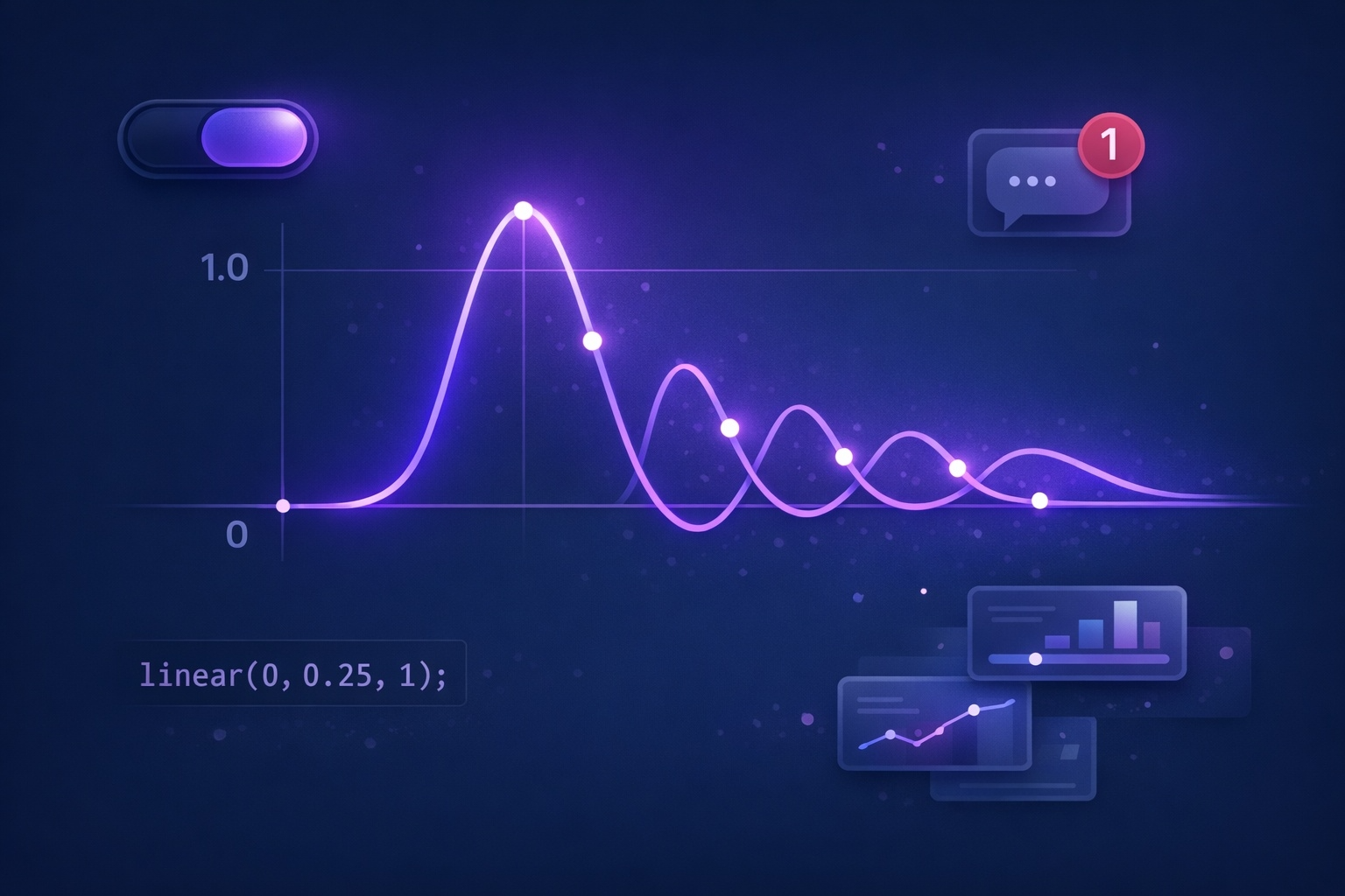
The mental model is straightforward. You list output values from 0 (start) to 1 (end), and the browser connects the dots with straight lines.
/* 2 stops = constant speed (same as linear keyword) */
animation-timing-function: linear(0, 1);

/* 3 stops = custom midpoint */
animation-timing-function: linear(0, 0.25, 1);

/* With a percentage: "reach 0.25 at the 75% mark" */
animation-timing-function: linear(0, 0.25 75%, 1);
With linear(0, 0.25, 1), the three points are evenly spaced. At the 50% mark, the output is only 0.25, then it accelerates to 1.0 in the second half — similar to ease-in. Add a percentage like 75% to shift when that value is reached: linear(0, 0.25 75%, 1) crawls to 0.25 over 75% of the duration, then sprints to 1.0 in the final 25%.
The crucial trick: values can go outside the 0–1 range. Set 1.2 for overshoot. Set -0.1 for pullback. That's what makes bounce and spring possible.
Building a Bounce — Making Things Hit and Rebound
Bounce is the most requested pattern. An element arrives at its destination, then rebounds — smaller each time — until it settles. Think notification badges, dropdown menus, toast messages.
The trick: the output value reaches 1, then dips below it, returns to 1, dips again (less), and so on. Each "dip" is a bounce.
.bounce-element {
  animation: bounceIn 800ms linear(
    0, 0.004, 0.016, 0.035, 0.063 9.1%,
    0.141, 0.25, 0.391, 0.563, 0.765, 1,
    0.891, 0.813 45.5%, 0.785, 0.766,
    0.754, 0.75, 0.754, 0.766, 0.785,
    0.813 63.6%, 0.891, 1 72.7%,
    0.973, 0.953, 0.941, 0.938,
    0.941, 0.953, 0.973, 1,
    0.988, 0.984, 0.988, 1
  ) forwards;
}
Don't write these numbers by hand. Jake Archibald and Adam Argyle's Linear Easing Generator has a "Bounce" preset built in. One click, copy, paste.
No JavaScript animation library. The keyframes are a simple translateY(0) to translateY(120px). All the bounce behavior comes from linear() alone.
Building a Spring — Overshoot and Settle
Where bounce dips below the target, spring goes past it. The element overshoots to, say, 1.12, swings back to 0.96, then oscillates until it rests at 1. Modals, toggles, card reveals — anywhere you want that satisfying "snap" feel.
.spring-element {
  transition: transform 600ms linear(
    0, 0.009, 0.035, 0.078, 0.141 13.6%,
    0.32, 0.557 27.3%, 0.801, 0.941,
    1.029 40.9%, 1.087, 1.119,
    1.126 52.3%, 1.107, 1.067,
    1.022 63.6%, 0.986, 0.966,
    0.958 75%, 0.966, 0.982,
    0.998 86.4%, 1.006, 1.01,
    1.008 95.5%, 1
  );
}Stagger the transition-delay by 80ms per card, and you get a cascading spring reveal — the kind of thing that used to require GSAP's stagger option. Now it's pure CSS.
Same distance, same duration. But the spring feels alive. That tiny overshoot-and-settle is what our eyes read as physical, natural motion.
Real-World Patterns — 5 Demos You Can Steal
1. Notification Badge Pop-In
2. Elastic Text Reveal
3. Toggle Switch with Spring
4. FAB Menu Expansion
5. Hover Card Lift
Accessibility — The Part You Can't Skip
Bounce and spring effects can trigger motion sickness in users with vestibular disorders. Always pair your linear() animations with a prefers-reduced-motion fallback.
.card {
  transition: transform 500ms linear(/* spring values */);
}

@media (prefers-reduced-motion: reduce) {
  .card {
    transition: transform 200ms ease;
  }
}
When reduced motion is active, swap the linear() for a simple ease and shorten the duration. Simple change, big impact for the people who need it.
Takeaways
- linear() lets you approximate any easing curve by plotting numeric stops and interpolating between them
- Bounce and spring effects — impossible with cubic-bezier() — now work in pure CSS without JavaScript
- Use Jake Archibald's Linear Easing Generator to create values from presets instead of writing them by hand
- Combine linear() with transition and transition-delay for staggered spring animations on class toggle
- Always provide a prefers-reduced-motion fallback — bounce effects can cause discomfort for vestibular disorder users
- Supported in Chrome 113+, Firefox 112+, Safari 17.2+ — use @supports with ease-out as a graceful fallback
- 20–40 stops are enough for visually smooth curves; more stops mean larger CSS but diminishing returns