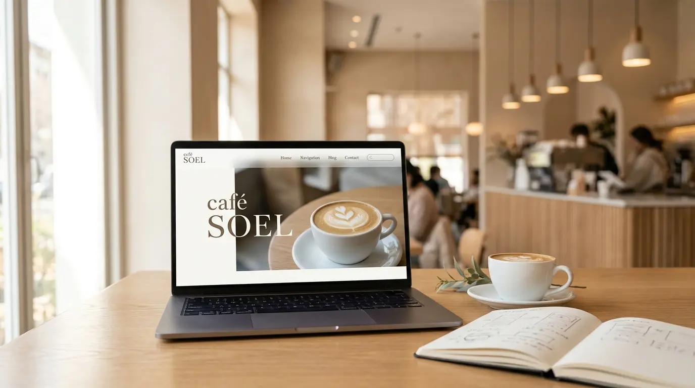
CSS Grid & Responsive Design —
Beautiful on Every Screen
Our menu cards and gallery photos are still stacked vertically, and the site breaks on small screens. Today we fix both: CSS Grid gives us beautiful multi-column layouts, and media queries make everything adapt to tablets and phones.
Quick Recap
- We learned Flexbox basics — adding display: flex to a parent makes its children line up horizontally
- We used justify-content, align-items, gap, and flex: 1 to lay out the header, concept, access, and footer
- We replaced the hero's position + transform centering with cleaner Flexbox centering
The header nav sits neatly beside the logo, the concept section shows the image and text side by side, and the footer is centered. But the menu cards are still stacked in a single column, the gallery is a plain vertical list, and if you shrink your browser window, things get cramped fast. Today we tackle both problems at once.
Goals for This Part
- Understand CSS Grid basics and lay out the menu cards in a 2-column grid and the gallery in a large-small layout
- Learn the concept of responsive design and implement media queries for tablet and mobile breakpoints
- Add a hamburger menu button in HTML and CSS, ready for JavaScript in a bonus part
See the Part 6 result →
What Is CSS Grid? — And How It Differs from Flexbox
Flexbox, which we learned last time, excels at arranging items along a single axis — a row of nav links, or a left-right split between an image and text. It's essentially one-dimensional.
CSS Grid works in two dimensions simultaneously. You define rows and columns, and items slot into a grid — much like a spreadsheet. When you need a 2×2 card layout or a gallery where one photo spans two rows, Grid is the right tool.
Think of it this way: Flexbox for a single line, Grid for a… well, grid. They're not competitors — they complement each other, and you'll often use both on the same page, just like we're doing with café SOEL.
Flexbox and Grid aren't enemies. They're good at different things. Knowing both gives you real layout freedom.
Grid Basics
Like Flexbox, Grid starts with a single declaration on the parent element: display: grid. The difference is that you also specify how many columns you want.
.menu-grid {
  display: grid;
  grid-template-columns: repeat(2, 1fr);
  gap: 32px;
}
grid-template-columns defines the columns. repeat(2, 1fr) means "repeat 1fr twice" — two equal-width columns. The fr unit stands for "fraction" and divides the available space equally. gap works the same as in Flexbox — it sets the space between items.
Four items automatically arranged in a 2×2 grid. With Flexbox you'd need flex-wrap: wrap and careful width calculations. Grid makes this effortless.
grid-row — Spanning Multiple Rows
One of Grid's most powerful features is letting an item span multiple rows. We'll use this for the gallery's "one large photo + two small photos" layout.
.gallery-item--large {
  grid-row: 1 / 3;  /* From grid line 1 to grid line 3 = 2 rows */
}The numbers in grid-row: 1 / 3 refer to grid lines, not item numbers. A 2-row grid has three horizontal lines: line 1 at the top, line 2 in the middle, and line 3 at the bottom. "From line 1 to line 3" means the item occupies both rows.
aspect-ratio — Locking Image Proportions
We want all menu card images to be perfect squares. The aspect-ratio property makes this simple.
.menu-card-image {
  aspect-ratio: 1 / 1;  /* Square */
  overflow: hidden;
}
Set it to 1 / 1 for a square, 16 / 9 for widescreen. Combined with overflow: hidden and object-fit: cover on the image, the photo gets neatly cropped to fit.
Laying Out the Menu with Grid
Let's apply Grid to café SOEL. Add the following to your css/style.css.
/* ---------- Menu Grid ---------- */
.menu-grid {
  display: grid;
  grid-template-columns: repeat(2, 1fr);
  gap: 32px;
  max-width: var(--container-width);
  margin: 0 auto;
}

.menu-card {
  background-color: var(--color-white);
  border-radius: 16px;
  overflow: hidden;
}

.menu-card-image {
  aspect-ratio: 1 / 1;
  overflow: hidden;
}

.menu-card-image img {
  width: 100%;
  height: 100%;
  object-fit: cover;
}
The .menu-card gets a white background, rounded corners, and overflow: hidden so images don't poke outside the rounded edges. Save and check your browser — the four menu cards should now sit in a neat 2×2 grid with square photos.
Laying Out the Gallery with Grid
Next, the gallery. We want one large photo on the left spanning two rows, with two smaller photos stacked on the right.
/* ---------- Gallery Grid ---------- */
.gallery-grid {
  display: grid;
  grid-template-columns: 1fr 1fr;
  grid-template-rows: auto auto;
  gap: 16px;
  max-width: var(--container-width);
  margin: 0 auto;
}

.gallery-item {
  border-radius: 12px;
  overflow: hidden;
}

.gallery-item img {
  width: 100%;
  height: 100%;
  object-fit: cover;
}

.gallery-item--large {
  grid-row: 1 / 3;
}
grid-template-columns: 1fr 1fr is the same as repeat(2, 1fr) — just a different way to write it. The .gallery-item--large class with grid-row: 1 / 3 makes the first photo (the window-side seating shot) span both rows, creating that magazine-style layout.
Responsive Design — Making It Work Everywhere
The grid looks great on a wide screen. But try narrowing your browser window. The text gets squeezed, cards become tiny, and horizontal layouts break. That's because we haven't told the browser how to adapt to different screen sizes yet.
Responsive design means ensuring your site looks good and works well on any screen size — desktops, tablets, and phones. Remember the <meta name="viewport"> tag we added in Part 2? That was laying the groundwork for exactly this. Without it, mobile browsers would just shrink the desktop layout to fit, making everything unreadable.
Responsive isn't just "making it work on phones." It's delivering the best experience at every screen size.
Media Queries — Conditional CSS
Media queries let you write CSS that only applies when certain conditions are met — most commonly, when the viewport is below a certain width.
/* Default styles (desktop) */
.menu-grid {
  grid-template-columns: repeat(2, 1fr);
}

/* When the viewport is 600px or narrower */
@media (max-width: 600px) {
  .menu-grid {
    grid-template-columns: 1fr;  /* Switch to 1 column */
  }
}Breakpoints — Where to Switch
The widths at which you switch layouts are called breakpoints. For café SOEL, we're using two.
900px — Tablet size. Side-by-side layouts switch to stacked, and the hamburger menu appears.
600px — Mobile size. The menu grid goes to a single column, font sizes shrink, and spacing tightens.
Adding the Hamburger Menu
On small screens, there's no room for a full horizontal nav bar. That's where the hamburger menu comes in — the three-line button that's ubiquitous on mobile sites.
Add the button to index.html
Insert a <button> element right before the <nav> tag inside the header.
<header class="header" id="top">
  <div class="header-inner">
    <a href="#top" class="logo">
      <img src="img/logo.png" alt="café SOEL" width="160" height="40">
    </a>

    <!-- ↓ Add this -->
    <button class="menu-toggle" type="button">
      <span class="menu-toggle-bar"></span>
      <span class="menu-toggle-bar"></span>
      <span class="menu-toggle-bar"></span>
    </button>

    <nav class="nav" aria-label="Main navigation">
      <!-- ... existing nav links ... -->
    </nav>
  </div>
</header>
The three <span class="menu-toggle-bar"> elements will form the three horizontal lines. We're building this with HTML and CSS rather than an image, so it's easy to style and animate later.
Also note that we've added class="nav" to the <nav> tag. In Part 3, it didn't have a class, but we need one now to toggle its visibility on mobile. Update your <nav aria-label="..."> to <nav class="nav" aria-label="...">.
Add CSS for the hamburger button
Hidden by default on desktop; it appears on mobile via a media query.
/* ---------- Hamburger Menu ---------- */
.menu-toggle {
  display: none;
  flex-direction: column;
  justify-content: center;
  gap: 5px;
  width: 32px;
  height: 32px;
  background: none;
  border: none;
  cursor: pointer;
  padding: 4px;
}

.menu-toggle-bar {
  display: block;
  width: 100%;
  height: 2px;
  background-color: var(--color-black);
  border-radius: 1px;
}Tablet Breakpoint — 900px
Now let's write the media queries. Add the following at the very end of your css/style.css.
/* ========================================
   Responsive: Tablet (900px and below)
   ======================================== */
@media (max-width: 900px) {

  :root {
    --section-padding: 80px;
  }

  .nav {
    display: none;
    position: fixed;
    inset: 0;
    background-color: rgba(255, 255, 255, 0.98);
    z-index: 99;
    align-items: center;
    justify-content: center;
  }

  .nav.is-open {
    display: flex;
  }

  .nav-list {
    flex-direction: column;
    align-items: center;
    gap: 32px;
  }

  .nav-link {
    font-size: 20px;
    letter-spacing: 3px;
  }

  .menu-toggle {
    display: flex;
    z-index: 101;
  }

  .concept-inner {
    flex-direction: column;
    gap: 40px;
  }

  .menu-grid {
    gap: 20px;
  }

  .gallery-grid {
    grid-template-columns: 1fr;
  }

  .gallery-item--large {
    grid-row: auto;
  }

  .access-inner {
    flex-direction: column;
    gap: 40px;
  }
}
Let's walk through the key changes. We reduce section padding to 80px since there's less vertical space on tablets. The .nav is hidden with display: none and becomes a full-screen overlay when .is-open is added — position: fixed and inset: 0 make it cover the entire screen. The nav links switch to a vertical stack with larger text for easy tapping.
The hamburger button switches to display: flex so it becomes visible, with z-index: 101 to sit above the nav overlay (z-index: 99). Both .concept-inner and .access-inner change to flex-direction: column, converting those side-by-side layouts to vertical stacks. The gallery goes to a single column and the large item's grid-row resets to auto.
Mobile Breakpoint — 600px
Right after the 900px media query, add the mobile styles.
/* ========================================
   Responsive: Mobile (600px and below)
   ======================================== */
@media (max-width: 600px) {

  :root {
    --section-padding: 60px;
  }

  .hero {
    min-height: 500px;
  }

  .hero-title {
    font-size: 26px;
    letter-spacing: 0.04em;
  }

  .menu-grid {
    grid-template-columns: 1fr;
  }

  .info-item {
    flex-direction: column;
    gap: 4px;
  }

  .info-item dt {
    width: auto;
  }

  .footer-nav {
    flex-direction: column;
    align-items: center;
    gap: 16px;
  }
}
On mobile we tighten spacing further, reduce the hero's minimum height, and shrink the hero title. The menu grid switches to a single column so each card gets the full width. The store info items stack vertically (label on top, value below), and the footer nav becomes a vertical list with comfortable tap spacing.
Testing Your Responsive Layout
Save everything and open your browser. Slowly drag the window's edge to narrow it.
Desktop (above 900px)
Menu cards in a 2-column grid, gallery in a large-small layout, concept and access side by side. No hamburger button visible.
Tablet (600px – 900px)
The hamburger appears, concept and access stack vertically, gallery switches to single column. Menu cards stay at 2 columns.
Mobile (below 600px)
Menu cards become a single column, hero title shrinks, store info stacks vertically, footer nav goes vertical.
Watch the layout shift smoothly as you cross the 900px and 600px breakpoints. That's responsive design in action.
Flexbox vs. Grid — When to Use Which
Let's take a moment to solidify the difference. Flexbox shines for one-dimensional arrangements: a header with a logo and nav on opposite ends, a row of links, a centered vertical stack in the footer. These are all "single line" layouts.
Grid shines for two-dimensional layouts: menu cards in a 2×2 grid, a gallery with items spanning multiple rows. Whenever you're thinking about both rows and columns, reach for Grid.
When you're unsure, ask yourself: "Am I just lining things up in one direction?" If yes, Flexbox. "Am I placing items in a grid pattern?" If yes, CSS Grid. And honestly, many layouts can be built with either — so just pick whichever feels simpler to write.
Notice that our media queries use both tools gracefully. Flexbox layouts switch from horizontal to vertical with flex-direction: column. Grid layouts drop from two columns to one with grid-template-columns: 1fr. Both transformations take just a single line of CSS.
With both Flexbox and Grid in your toolkit, there's very little you can't lay out. The hard part isn't writing CSS — it's deciding which approach fits best.
Full Code at This Point
We changed both HTML and CSS in this part. If anything looks off, copy the full code below to get back on track.
See the Part 6 result →
index.html (Part 6 complete)
<!DOCTYPE html>
<html lang="ja">
<head>
<meta charset="UTF-8">
<meta name="viewport" content="width=device-width, initial-scale=1.0">
<title>café SOEL — そよぐ光と、ひと息つくひととき</title>
<link rel="stylesheet" href="css/style.css">
</head>
<body>
<!-- ========== HEADER ========== -->
<header class="header" id="top">
<div class="header-inner">
<a href="#top" class="logo">
<img src="img/logo.png" alt="café SOEL" width="160" height="40">
</a>
<button class="menu-toggle" type="button">
<span class="menu-toggle-bar"></span>
<span class="menu-toggle-bar"></span>
<span class="menu-toggle-bar"></span>
</button>
<nav class="nav" aria-label="Main navigation">
<ul class="nav-list">
<li><a href="#concept" class="nav-link">Concept</a></li>
<li><a href="#menu" class="nav-link">Menu</a></li>
<li><a href="#gallery" class="nav-link">Gallery</a></li>
<li><a href="#access" class="nav-link">Access</a></li>
</ul>
</nav>
</div>
</header>
<main>
<!-- ========== HERO ========== -->
<section class="hero" id="hero">
<div class="hero-image">
<img src="img/hero.jpg" alt="Inside café SOEL with natural light flooding through large windows" width="1920" height="1080">
</div>
<div class="hero-content">
<p class="hero-sub">Natural Light & Coffee</p>
<h1 class="hero-title">そよぐ光と、<br>ひと息つくひととき。</h1>
<a href="#concept" class="hero-cta">Scroll</a>
</div>
</section>
<!-- ========== CONCEPT ========== -->
<section class="concept section" id="concept">
<div class="concept-inner">
<div class="concept-image">
<img src="img/concept.jpg" alt="Hand-drip coffee and a ceramic cup on a wooden table" width="1200" height="800">
</div>
<div class="concept-text">
<span class="section-label">Concept</span>
<h2 class="section-heading">ひかりと、木と、<br>一杯のコーヒーと。</h2>
<p>café SOEL(カフェ ソエル)は、「そよぐ光」をイメージした造語から名づけました。</p>
<p>大きな窓から差し込む自然光、ナチュラルな木のぬくもり、丁寧に淹れた一杯のコーヒー。忙しい日常からすこしだけ離れて、穏やかな時間を過ごしていただける場所でありたいと思っています。</p>
<p>素材の味を大切にしたフードとドリンクを、心を込めてお届けします。</p>
</div>
</div>
</section>
<!-- ========== MENU ========== -->
<section class="menu section" id="menu">
<div class="section-header">
<span class="section-label">Menu</span>
<h2 class="section-heading">こだわりのメニュー</h2>
<p class="section-desc">素材を活かしたシンプルなおいしさを、丁寧にお届けします。</p>
</div>
<div class="menu-grid">
<article class="menu-card">
<div class="menu-card-image">
<img src="img/menu-coffee.jpg" alt="Hand-drip coffee" width="800" height="800">
</div>
<div class="menu-card-body">
<h3 class="menu-card-title">Hand Drip Coffee</h3>
<p class="menu-card-desc">産地ごとに異なる豆の個性を引き出す、一杯ずつ丁寧なハンドドリップ。</p>
<span class="menu-card-price">¥550</span>
</div>
</article>
<article class="menu-card">
<div class="menu-card-image">
<img src="img/menu-latte.jpg" alt="Café latte with simple latte art" width="800" height="800">
</div>
<div class="menu-card-body">
<h3 class="menu-card-title">Café Latte</h3>
<p class="menu-card-desc">まろやかなミルクとエスプレッソのバランス。シンプルなラテアートを添えて。</p>
<span class="menu-card-price">¥600</span>
</div>
</article>
<article class="menu-card">
<div class="menu-card-image">
<img src="img/menu-cake.jpg" alt="Rustic seasonal cake" width="800" height="800">
</div>
<div class="menu-card-body">
<h3 class="menu-card-title">Seasonal Cake</h3>
<p class="menu-card-desc">季節のフルーツを使った、素朴だけど美しいケーキ。コーヒーとの相性も抜群です。</p>
<span class="menu-card-price">¥650</span>
</div>
</article>
<article class="menu-card">
<div class="menu-card-image">
<img src="img/menu-sandwich.jpg" alt="Cross-section of a fresh sandwich" width="800" height="800">
</div>
<div class="menu-card-body">
<h3 class="menu-card-title">SOEL Sandwich</h3>
<p class="menu-card-desc">新鮮な野菜とハム、自家製ソースをはさんだボリュームのあるサンドイッチ。</p>
<span class="menu-card-price">¥900</span>
</div>
</article>
</div>
</section>
<!-- ========== GALLERY ========== -->
<section class="gallery section" id="gallery">
<div class="section-header">
<span class="section-label">Gallery</span>
<h2 class="section-heading">店内の様子</h2>
<p class="section-desc">自然光と木のぬくもりに包まれた、穏やかな空間。</p>
</div>
<div class="gallery-grid">
<div class="gallery-item gallery-item--large">
<img src="img/interior-01.jpg" alt="Window-side seating bathed in natural light" width="1200" height="800">
</div>
<div class="gallery-item">
<img src="img/interior-02.jpg" alt="Wooden counter with pendant lights" width="1200" height="800">
</div>
<div class="gallery-item">
<img src="img/exterior.jpg" alt="White exterior walls with black-framed windows" width="1600" height="1000">
</div>
</div>
</section>
<!-- ========== ACCESS ========== -->
<section class="access section" id="access">
<div class="access-inner">
<div class="access-image">
<img src="img/exterior.jpg" alt="café SOEL exterior" width="1600" height="1000">
</div>
<div class="access-info">
<span class="section-label">Access</span>
<h2 class="section-heading">店舗情報</h2>
<dl class="info-list">
<div class="info-item">
<dt>住所</dt>
<dd>〒156-0054 東京都世田谷区桜丘町3-12-8</dd>
</div>
<div class="info-item">
<dt>営業時間</dt>
<dd>
平日 10:00 – 19:00<br>
土日 9:00 – 19:00
</dd>
</div>
<div class="info-item">
<dt>定休日</dt>
<dd>毎週水曜日</dd>
</div>
<div class="info-item">
<dt>電話</dt>
<dd><a href="tel:03-0000-0000">03-0000-0000</a></dd>
</div>
<div class="info-item">
<dt>アクセス</dt>
<dd>小田急線 千歳船橋駅より徒歩8分</dd>
</div>
</dl>
</div>
</div>
</section>
</main>
<!-- ========== FOOTER ========== -->
<footer class="footer">
<div class="footer-inner">
<a href="#top" class="footer-logo">
<img src="img/logo.png" alt="café SOEL" width="120" height="30">
</a>
<ul class="footer-nav">
<li><a href="#concept">Concept</a></li>
<li><a href="#menu">Menu</a></li>
<li><a href="#gallery">Gallery</a></li>
<li><a href="#access">Access</a></li>
</ul>
<p class="footer-copy">© 2025 café SOEL. All rights reserved.</p>
</div>
</footer>
</body>
</html>css/style.css (Part 6 complete)
The CSS file is the same as shown in the Japanese version above. Refer to the full CSS code block in the Japanese article — since CSS is language-independent, the file is identical.
What You Learned
- CSS Grid uses display: grid and grid-template-columns for two-dimensional layouts — both rows and columns at once
- repeat(2, 1fr) creates two equal columns; grid-row: 1 / 3 lets an item span multiple rows using grid line numbers
- aspect-ratio: 1 / 1 locks an element's proportions to a square, and object-fit: cover crops the image to fit
- Flexbox handles one-dimensional alignment; Grid handles two-dimensional placement — use both based on what fits
- Media queries (@media (max-width: ...)) apply different CSS at different viewport widths — this is the core of responsive design
- We set breakpoints at 900px (tablet) and 600px (mobile), switching side-by-side layouts to stacked ones
- A hamburger menu button was added to the HTML and styled with CSS — the open/close JavaScript will come in bonus Part EX2