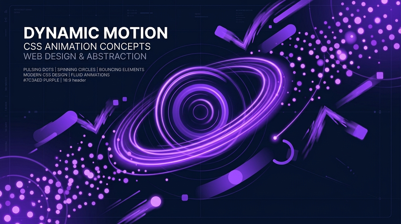
CSS Animations Demystified —
Mastering transition and @keyframes
A button that subtly shifts color on hover. A spinner that keeps turning. Content that fades into view as the page loads. All of this is pure CSS — no JavaScript required. Let's learn how it works.
transition vs animation — Two Tools, Different Jobs
CSS gives you two mechanisms for motion: transition and animation (with @keyframes). They look similar in tutorials, but they serve fundamentally different purposes in real projects.
transition smooths the change between two states. You define the starting state and the ending state, and the browser fills in the frames in between. Critically, a transition needs a trigger — a :hover, a :focus, or a class change via JavaScript. Without a trigger, nothing happens.
animation runs on its own. It can start on page load, loop forever, go in reverse, and pass through as many intermediate stages as you want. If you need something to move without the user doing anything, this is your tool.
.button {
  background: #7c3aed;
  transition: background 0.3s ease;
}
.button:hover {
  background: #5b21b6;
}@keyframes spin {
from { transform: rotate(0deg); }
to { transform: rotate(360deg); }
}
.spinner {
animation: spin 1s linear infinite;
}Mastering transition — the Four Sub-Properties
The transition shorthand actually bundles four sub-properties: transition-property (what changes), transition-duration (how long), transition-timing-function (what curve), and transition-delay (when it starts). In practice, you'll write them as a single line most of the time.
/* transition: [property] [duration] [timing] [delay] */

.card {
  transition: transform 0.3s ease;
}

/* Multiple properties */
.card {
  transition: transform 0.3s ease,
              box-shadow 0.3s ease,
              opacity 0.3s ease;
}
Easing — the "Feel" of Motion
The timing function is what separates animations that feel polished from those that feel robotic. Even at the same duration, ease and linear create completely different impressions. The human eye expects acceleration and deceleration — that's why ease and ease-in-out tend to feel more natural.
Hover anywhere on the demo to trigger all balls simultaneously
The Hover Lift — the Pattern You'll Use Everywhere
The "lift on hover" effect is probably the single most common transition pattern in production websites. Combine transform: translateY() with a deepening box-shadow, and the card appears to float off the page.
.card {
  transition: transform 0.3s ease,
              box-shadow 0.3s ease;
}
.card:hover {
  transform: translateY(-6px);
  box-shadow: 0 12px 32px rgba(0, 0, 0, 0.12);
}@keyframes — Writing Your Own Animation Script
While transitions handle A-to-B changes, @keyframes lets you choreograph multi-step sequences. You define keyframes at percentage points from 0% to 100%, and the browser interpolates between them. It's like writing a script for a play — you set the key moments and the browser fills in the rest.
@keyframes fadeInUp {
  0% {
    opacity: 0;
    transform: translateY(30px);
  }
  100% {
    opacity: 1;
    transform: translateY(0);
  }
}

.element {
  animation: fadeInUp 0.6s ease forwards;
}
Four Patterns You'll Reach For Again and Again
/* Spin */
@keyframes spin {
  to { transform: rotate(360deg); }
}

/* Pulse */
@keyframes pulse {
  0%, 100% { transform: scale(1); }
  50%       { transform: scale(1.15); }
}

/* Bounce */
@keyframes bounce {
  0%, 100% { transform: translateY(0); }
  50%       { transform: translateY(-16px); }
}

/* Shake */
@keyframes shake {
  0%, 100% { transform: translateX(0); }
  25%       { transform: translateX(-6px); }
  75%       { transform: translateX(6px); }
}
Building Loading Spinners with Pure CSS
Loading spinners are one of the most common real-world uses for CSS animations. You don't need a library — a few lines of CSS and a single HTML element can produce something polished and professional.
Accessibility — Respecting prefers-reduced-motion
Animations make interfaces feel alive, but not everyone experiences them the same way. People with vestibular disorders can experience dizziness, nausea, or disorientation from excessive motion on screen. This isn't an edge case — it affects a significant number of users.
CSS provides the prefers-reduced-motion media query, which detects when a user has enabled the "reduce motion" setting in their OS. Respecting this setting isn't just a nice thing to do — it's the right way to build.
@media (prefers-reduced-motion: reduce) {
  *,
  *::before,
  *::after {
    animation-duration: 0.01ms !important;
    animation-iteration-count: 1 !important;
    transition-duration: 0.01ms !important;
  }
}/* animation: none removes fill-mode state too — can break layouts */
@media (prefers-reduced-motion: reduce) {
* { animation: none !important; }
}Takeaways
- Use transition for state changes triggered by user interaction (hover, focus, class toggle) and animation with @keyframes for motion that plays automatically or loops.
- The timing function (easing) defines how motion feels — ease and ease-in-out for natural UI motion, linear for mechanical movement, cubic-bezier() for brand personality.
- The hover lift pattern (translateY + box-shadow transition) is the most commonly used effect in production and takes just a few lines of CSS.
- Loading spinners built with pure CSS require no external libraries — a border, border-radius, and a rotate keyframe animation are all you need for a professional result.
- Stagger animation-delay across sibling elements to create wave, cascade, and typing-indicator effects with minimal code.
- Always respect prefers-reduced-motion — set animation-duration to 0.01ms (not animation: none) to preserve fill-mode states while eliminating visible motion.