CSS grid-template-areas in Practice —
Layout Design by Name, Not by Number
What if you could draw your layout map directly in CSS? That's exactly what grid-template-areas does. Name your regions, assign them, and watch a complex header-sidebar-main-footer structure snap into place — no coordinate math required.
The "Which Cell Is This Again?" Problem
If you've spent any time with CSS Grid, you've probably written something like grid-column: 1 / 3 or grid-row: 2 / 4 — and then come back a week later completely unable to picture what that means without staring at DevTools.
Numbers work. But they don't communicate. The moment your layout has more than three or four regions, coordinate-based placement becomes a chore to read and a nightmare to maintain.
Enter grid-template-areas. Instead of placing elements by column and row indices, you draw an ASCII map of your layout in the CSS itself, then give each element a name to match. The code looks like the layout looks. That's the whole idea — and it's surprisingly powerful.
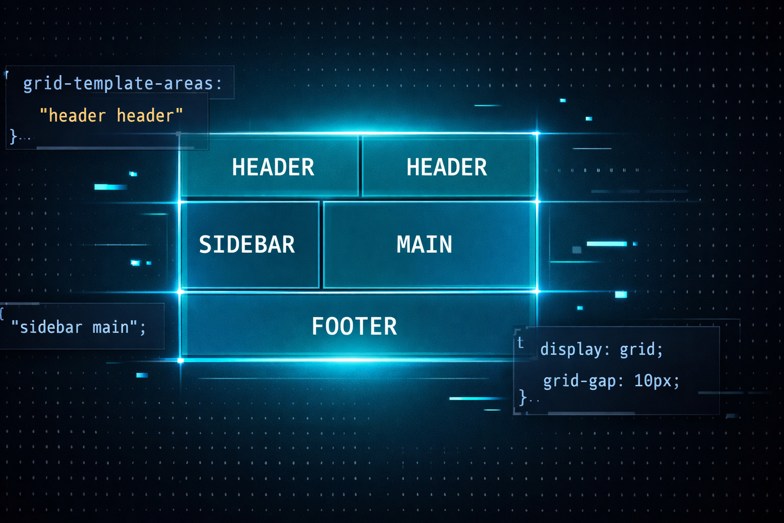
The Basics — Get It Running in 10 Lines
The setup is two-step: define the map on the parent with grid-template-areas, then assign each child element its name with grid-area. That's it.
<div class="layout">
  <header class="l-header">Header</header>
  <nav    class="l-sidebar">Sidebar</nav>
  <main   class="l-main">Main</main>
  <footer class="l-footer">Footer</footer>
</div>.layout {
display: grid;
grid-template-columns: 200px 1fr;
grid-template-rows: auto 1fr auto;
grid-template-areas:
"header header"
"sidebar main"
"footer footer";
min-height: 100vh;
gap: 12px;
}
.l-header { grid-area: header; }
.l-sidebar { grid-area: sidebar; }
.l-main { grid-area: main; }
.l-footer { grid-area: footer; }Look at the grid-template-areas value. Those three quoted strings are your layout map — row by row. "header header" means header spans both columns in that row. The visual structure of the code mirrors the visual structure of the page.
Real-World Patterns — Three You'll Actually Use
① Responsive layouts — just redraw the map
This is where grid-template-areas really shines. For responsive layouts, you don't touch the children at all. You rewrite the map on the parent, and every named element falls into its new position automatically.
.layout {
  display: grid;
  gap: 16px;

  /* Mobile: stack everything vertically */
  grid-template-columns: 1fr;
  grid-template-areas:
    "header"
    "main"
    "sidebar"
    "footer";
}

@media (min-width: 768px) {
  .layout {
    grid-template-columns: 1fr 280px;
    grid-template-areas:
      "header  header"
      "main    sidebar"
      "footer  footer";
  }
}
On mobile, sidebar drops below main. On desktop, it moves to the right. No changes to the child elements. The entire layout shift is managed in one place — the parent's map.
② Empty cells with . (dot notation)
Need a gap in your layout — a cell with nothing in it? Use a dot. You can chain multiple dots for multi-cell empty areas.
grid-template-areas:
  "header header header"
  ".      main   sidebar"  /* left column intentionally empty */
  "footer footer footer";
③ NG vs. OK — why number-based placement loses
.header  { grid-column: 1 / 3; grid-row: 1; }
.sidebar { grid-column: 1; grid-row: 2; }
.main    { grid-column: 2; grid-row: 2; }
.footer { grid-column: 1 / 3; grid-row: 3; }/* Entire layout managed in one place */
.layout {
grid-template-areas:
"header header"
"sidebar main"
"footer footer";
}
.header { grid-area: header; }
.sidebar { grid-area: sidebar; }
.main { grid-area: main; }
.footer { grid-area: footer; }Going Further — Using It Inside Card Components
Page-level layouts aren't the only use case. Card components — thumbnail, category, title, excerpt, tags — are a perfect fit for named areas too. If you ever need to reorder the elements visually without changing the HTML, you just redraw the map.
.article-card {
  display: grid;
  grid-template-columns: 120px 1fr;
  grid-template-rows: auto auto 1fr auto;
  grid-template-areas:
    "thumb  category"
    "thumb  title"
    "thumb  excerpt"
    "thumb  tags";
  gap: 4px 16px;
}

.card-thumb    { grid-area: thumb; }
.card-category { grid-area: category; }
.card-title    { grid-area: title; }
.card-excerpt  { grid-area: excerpt; }
.card-tags     { grid-area: tags; }
Notice that thumb appears in all four rows of the map — which means it automatically spans all four rows without needing a single grid-row declaration. The spanning comes from the map, not from numbers you have to calculate and update every time the layout changes.
Takeaways
- grid-template-areas lets you write your layout as a text map — the CSS structure mirrors the visual structure of the page.
- Children only need grid-area: name; — no coordinates, no span calculations.
- Responsive layouts become a map swap on the parent. Child elements need zero changes.
- Use . (dot) to define intentionally empty cells in the grid.
- Works great for both page-level skeletons and component-level layouts like cards.
- All named regions must be rectangular — combine with coordinate placement for non-rectangular exceptions.