Adding Motion with
CSS Animations
The main series gave your café SOEL site structure, style, and substance. Now let's give it life. We'll add fade-in effects, scroll-triggered reveals, and refined hover interactions — all with pure CSS.
Where We Left Off and Where We're Headed
- Over 10 parts, you built the café SOEL website from scratch — HTML, CSS, responsive design, SEO, and accessibility
- In Part 7, you added transitions and hover effects: nav underline animations, card lifts, and image zooms
- Your site is complete, published, and ready for enhancement
Congratulations on finishing the main series! You have a fully functional, responsive, SEO-ready website sitting in front of you. That's a real achievement.
In this bonus part, we're adding another layer of polish: motion. When content gently fades in as you open the page, or sections reveal themselves as you scroll — those subtle touches make a site feel crafted rather than just coded.
- Understand @keyframes and create fade-in animations
- Learn how scroll-triggered animations work and prepare the CSS for them
- Refine hover effects for a more polished feel
- Understand the hamburger-to-X transform animation
- Use prefers-reduced-motion to respect users who are sensitive to movement
In Part 7, you learned transition — a way to smooth the change between state A and state B. The @keyframes animations we'll learn today are more flexible. They let you define intermediate steps in a sequence, giving you finer control over how things move.
That said, the goal isn't to make everything bounce and spin.
The best animation is the kind users barely notice. You're not designing the motion itself — you're designing the feeling the motion creates.
Let's keep that principle close as we work through this.
@keyframes — The Animation Blueprint
At the heart of CSS animations is @keyframes. Think of it as a blueprint that tells the browser: "At this point in time, the element should look like this. At that point, it should look like that." The browser fills in the frames between.
The Basic Syntax
Let's start with the simplest possible example — a fade-in that takes an element from invisible to visible.
/* Define the animation blueprint */
@keyframes fadeIn {
  from {
    opacity: 0;
  }
  to {
    opacity: 1;
  }
}
from is the starting state, to is the ending state. Here, opacity goes from 0 (invisible) to 1 (fully visible). Simple enough, right?
To actually play this animation on an element, you use the animation property.
.hero-content {
  animation: fadeIn 0.8s ease-out both;
}
Reading left to right: which blueprint to use, how long it takes, what easing curve to follow, and what to do after it finishes.
animation: [name] [duration] [timing-function] [fill-mode];
name — the name you gave your @keyframes (e.g. fadeIn)
duration — how long it plays (e.g. 0.8s)
timing-function — the acceleration curve (e.g. ease-out)
fill-mode — whether to keep the end state after finishing (both is the safest default)
You can also add delay (wait before starting) and iteration-count (how many times to repeat). We'll use delay shortly.
Using Percentages Instead of from / to
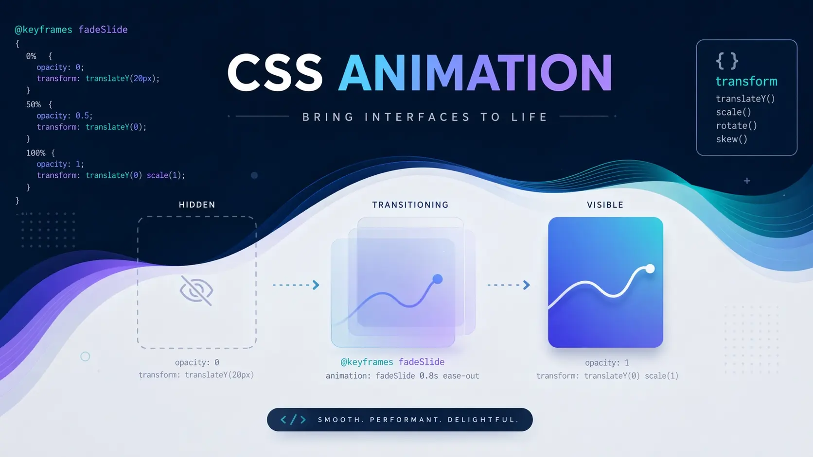
from and to are actually shorthand for 0% and 100%. If you want to add intermediate steps, use percentage values.
@keyframes fadeInUp {
  0% {
    opacity: 0;
    transform: translateY(24px);
  }
  100% {
    opacity: 1;
    transform: translateY(0);
  }
}
This fadeInUp animation combines two changes at once: the element starts 24 pixels below its final position and fully transparent, then slides up into place while fading in. The result is a gentle upward reveal that feels more refined than a simple opacity change.
Try it out in this demo. Click the button to play fadeInUp.
See how it rises gently into view? The travel distance is just 24 pixels, the duration is 0.8 seconds. Subtle, but that subtlety is exactly what makes it feel polished.
Animating the Hero Section on Page Load
Let's add animations to the actual café SOEL site. The hero section is the first thing visitors see, so a gentle entrance here sets the tone for the entire experience.
Add the following to the bottom of your css/style.css.
/* ========== Animation Keyframes ========== */

@keyframes fadeInUp {
  from {
    opacity: 0;
    transform: translateY(24px);
  }
  to {
    opacity: 1;
    transform: translateY(0);
  }
}

@keyframes fadeIn {
  from {
    opacity: 0;
  }
  to {
    opacity: 1;
  }
}

/* ========== Hero Animation ========== */

.hero-sub {
  animation: fadeIn 1s ease-out 0.2s both;
}

.hero-title {
  animation: fadeInUp 0.8s cubic-bezier(0.22, 1, 0.36, 1) 0.5s both;
}

.hero-cta {
  animation: fadeIn 0.8s ease-out 1s both;
}
Three elements, each with a different delay. The subtitle quietly fades in at 0.2 seconds. The main title rises into place at 0.5 seconds. The scroll button appears last, at 1 second. This sequential entrance is called staggering — each element arrives just a beat after the previous one.
Save your file and reload the browser. You should see the hero text appear in a graceful sequence.
Getting the Timing Right
When setting up staggered delays, aim for 0.1–0.3 seconds between each element. Too much gap and the user feels like they're waiting. The total entrance sequence for the hero should wrap up within about 1.5–2 seconds. Anything longer and visitors start to feel impatient.
Five boxes appearing one after another, each 0.08 seconds apart. The delay is tiny, but compare it to all five appearing at once — the difference in feel is dramatic.
Scroll-Triggered Animations — Revealing Content on Scroll
Beyond the hero, let's make the rest of the page come alive too. As visitors scroll down, each section will gently fade in rather than sitting there static from the start.
How It Works
There are two main approaches to scroll-triggered animations today.
The first uses JavaScript's Intersection Observer API. It detects when an element enters the viewport and adds a CSS class to trigger the animation. We'll implement the JavaScript side in Bonus Part 2, but we can prepare all the CSS right now.
The second approach uses the CSS animation-timeline property — a newer spec that handles scroll-driven animations without any JavaScript. It's supported in Chrome, Edge, and Safari, but Firefox still doesn't enable it by default. For reliable cross-browser support, we'll go with the Intersection Observer approach.
Preparing the CSS — "Waiting" and "Visible" States
The concept is simple: start with elements invisible, then when they enter the viewport, add a class that triggers a transition to the visible state.
/* ========== Scroll Animation ========== */

/* Waiting state: not yet in viewport */
.fade-in-up {
  opacity: 0;
  transform: translateY(24px);
  transition: opacity 0.6s cubic-bezier(0.22, 1, 0.36, 1),
              transform 0.6s cubic-bezier(0.22, 1, 0.36, 1);
}

/* Visible state: element has entered the viewport */
.fade-in-up.is-visible {
  opacity: 1;
  transform: translateY(0);
}
Notice we're using transition here instead of @keyframes. Since this is a simple A-to-B state change triggered by a class toggle, transition is the cleaner tool for the job.
A quick guide on when to use which: transition is ideal for changes between two states — hover effects, class toggles, anything where the trigger is a state change. @keyframes is better when you need intermediate steps, looping, or auto-playing animation on page load.
Adding Classes to the HTML
Open index.html and add the fade-in-up class to the elements you want to animate on scroll.
<!-- Concept section -->
<div class="concept-inner fade-in-up">

<!-- Menu section header -->
<div class="section-header fade-in-up">

<!-- Menu grid -->
<div class="menu-grid fade-in-up">

<!-- Gallery section header -->
<div class="section-header fade-in-up">

<!-- Gallery grid -->
<div class="gallery-grid fade-in-up">

<!-- Access section -->
<div class="access-inner fade-in-up">If you check the browser now, those elements will be invisible — that's expected. They're in their "waiting" state because the is-visible class hasn't been added yet.
The JavaScript that adds is-visible on scroll will come in Bonus Part 2. But if you'd like to see it working right now, here's a minimal script you can drop in.
<script>
  // Scroll-triggered animation
  const observer = new IntersectionObserver((entries) => {
    entries.forEach((entry) => {
      if (entry.isIntersecting) {
        entry.target.classList.add('is-visible');
      }
    });
  }, { threshold: 0.15 });

  document.querySelectorAll('.fade-in-up').forEach((el) => {
    observer.observe(el);
  });
</script>
This tells the browser to watch every .fade-in-up element and add is-visible when 15% of it comes into view. Save, scroll down, and watch each section rise into place. We'll break down exactly how this code works in Bonus Part 2.
Refining Hover Effects
In Part 7, you added card lifts, image zooms, and nav underlines. Let's push that polish a little further.
Adding a Resting Shadow to Cards
Here's the menu card hover from Part 7:
.menu-card {
  transition: transform var(--transition-base), box-shadow var(--transition-base);
}

.menu-card:hover {
  transform: translateY(-4px);
  box-shadow: 0 12px 40px rgba(0, 0, 0, 0.08);
}
One small improvement: add a very faint shadow to the card's resting state. When there's no shadow at all in the default state, the hover shadow can feel like it pops in from nowhere. A subtle baseline shadow makes the transition seamless.
/* Add to .menu-card's existing styles */
.menu-card {
  box-shadow: 0 2px 12px rgba(0, 0, 0, 0.04);
  /* ↑ add this line */
}Hover over this card
The card lifts gently while the image inside zooms in slightly. Two things moving at once, but each subtle enough that the overall effect feels natural rather than busy.
Customizing the Easing Curve
In Part 7, var(--transition-base) was set to 0.3s ease. You can change the feel of every hover on the site just by updating that variable.
/* In :root, update the variable */
:root {
  --transition-base: 0.35s cubic-bezier(0.22, 1, 0.36, 1);
  /* was: 0.3s ease */
}
This curve starts fast and settles slowly — like a real object decelerating. It feels more natural than the generic ease. This is optional, of course. The original values work fine too.
Understanding the Hamburger-to-X Transform
In Part 7, you added CSS that transforms the three-bar hamburger icon into an X when the menu opens. Let's take a closer look at how that actually works, because the logic is elegant and worth understanding.
The hamburger button has three <span> elements — three horizontal bars stacked vertically.
<button class="menu-toggle" aria-label="Open menu" aria-expanded="false">
  <span class="menu-toggle-bar"></span>
  <span class="menu-toggle-bar"></span>
  <span class="menu-toggle-bar"></span>
</button>
To turn three horizontal lines into an X, you need three things to happen simultaneously. The top bar slides down to the center and rotates 45 degrees. The bottom bar slides up to the center and rotates -45 degrees. The middle bar fades away.
.menu-toggle-bar {
  transition: transform var(--transition-base),
              opacity var(--transition-base);
}

/* Top bar: move down to center, rotate 45° */
.menu-toggle.is-open .menu-toggle-bar:nth-child(1) {
  transform: translateY(7px) rotate(45deg);
}

/* Middle bar: fade out */
.menu-toggle.is-open .menu-toggle-bar:nth-child(2) {
  opacity: 0;
}

/* Bottom bar: move up to center, rotate -45° */
.menu-toggle.is-open .menu-toggle-bar:nth-child(3) {
  transform: translateY(-7px) rotate(-45deg);
}
The translateY(7px) value comes from the bar height (2px) plus the gap between bars (5px) = 7px. That's exactly one "row" of distance, which places the top bar right on top of the middle bar's position. Adjust this number if your bar thickness or gap is different.
Click to toggle
Click it back and forth. The bars smoothly morph between the hamburger and X shapes because transition is animating the transform and opacity changes. Without the transition, the state would snap instantly — functional, but jarring.
prefers-reduced-motion — Respecting User Preferences
We've been adding motion throughout this article, but not everyone experiences animation the same way. For people with vestibular disorders, screen motion can cause dizziness, nausea, or headaches. Others simply find excessive animation distracting.
Operating systems let users indicate they'd prefer less motion, and CSS gives us a media query to respond to that setting: prefers-reduced-motion.
/* ========== Reduced Motion ========== */

@media (prefers-reduced-motion: reduce) {
  /* Disable hero entrance animations */
  .hero-sub,
  .hero-title,
  .hero-cta {
    animation: none;
  }

  /* Disable scroll animations */
  .fade-in-up {
    opacity: 1;
    transform: none;
    transition: none;
  }

  /* Tone down hover transforms */
  .menu-card:hover {
    transform: none;
  }

  .concept-image:hover img,
  .menu-card:hover .menu-card-image img,
  .gallery-item:hover img {
    transform: none;
  }
}
The key principle: "reduced motion" doesn't mean "no interaction." We're removing spatial movement — things sliding, scaling, and floating — but keeping color changes, focus indicators, and other non-motion feedback intact. The site stays fully usable and interactive; it just doesn't move.
Accessibility isn't an afterthought. Every time you add an animation, also add the code that disables it. They're two halves of the same feature.
Performance Considerations
Before we wrap up, let's talk about why some animations feel smooth and others feel stuttery. Understanding what's happening under the hood helps you debug issues on your own.
Why transform and opacity Are Special
Browsers render a page in three main phases: layout, paint, and composite. Changing width or margin triggers the layout phase — the browser has to recalculate where everything on the page sits. Changing background-color or box-shadow triggers the paint phase, which is lighter but still has a cost.
Changing transform or opacity, however, only triggers the composite phase. The GPU handles this efficiently without touching layout or paint, which is why these two properties can animate at a buttery 60 frames per second.
Use will-change Sparingly
There's a CSS property called will-change that hints to the browser: "This element's transform is about to change — prepare for it." It can improve performance in specific cases.
.menu-card {
  will-change: transform;
}
But this is a last resort, not a default. The browser allocates extra memory for each element with will-change, so applying it broadly can actually hurt performance. Only reach for it when a specific animation is stuttering and you've already confirmed you're only animating transform and opacity.
For our café SOEL site, you likely won't need will-change at all. The animations we've added are lightweight, and modern browsers handle them well automatically.
All the Code We Added
Here's a consolidated view of everything we added to css/style.css in this bonus part. Append this to the end of your existing stylesheet.
/* ===================================
   Bonus Part 1: CSS Animations
   =================================== */

/* ---------- Keyframes ---------- */

@keyframes fadeInUp {
  from {
    opacity: 0;
    transform: translateY(24px);
  }
  to {
    opacity: 1;
    transform: translateY(0);
  }
}

@keyframes fadeIn {
  from {
    opacity: 0;
  }
  to {
    opacity: 1;
  }
}

/* ---------- Hero Animation ---------- */

.hero-sub {
  animation: fadeIn 1s ease-out 0.2s both;
}

.hero-title {
  animation: fadeInUp 0.8s cubic-bezier(0.22, 1, 0.36, 1) 0.5s both;
}

.hero-cta {
  animation: fadeIn 0.8s ease-out 1s both;
}

/* ---------- Scroll Animation ---------- */

.fade-in-up {
  opacity: 0;
  transform: translateY(24px);
  transition: opacity 0.6s cubic-bezier(0.22, 1, 0.36, 1),
              transform 0.6s cubic-bezier(0.22, 1, 0.36, 1);
}

.fade-in-up.is-visible {
  opacity: 1;
  transform: translateY(0);
}

/* ---------- Card Shadow Enhancement ---------- */

/* Add to .menu-card */
.menu-card {
  box-shadow: 0 2px 12px rgba(0, 0, 0, 0.04);
}

/* ---------- Reduced Motion ---------- */

@media (prefers-reduced-motion: reduce) {
  .hero-sub,
  .hero-title,
  .hero-cta {
    animation: none;
  }

  .fade-in-up {
    opacity: 1;
    transform: none;
    transition: none;
  }

  .menu-card:hover {
    transform: none;
  }

  .concept-image:hover img,
  .menu-card:hover .menu-card-image img,
  .gallery-item:hover img {
    transform: none;
  }
}
And in index.html, here's what changed:
<!-- Added fade-in-up class to these elements: -->
<div class="concept-inner fade-in-up">
<div class="section-header fade-in-up">  <!-- Menu -->
<div class="menu-grid fade-in-up">
<div class="section-header fade-in-up">  <!-- Gallery -->
<div class="gallery-grid fade-in-up">
<div class="access-inner fade-in-up">

<!-- Added scroll observer script before </body> (detailed in Bonus Part 2) -->
Save everything and try it in the browser. The hero text should animate in on page load, and as you scroll, each section should gently rise into view.
What You Learned
- @keyframes defines the animation blueprint; the animation property applies it to an element
- animation-delay creates stagger effects — elements appearing in sequence — that feel natural and deliberate
- Scroll-triggered animations combine CSS "waiting" states with JavaScript class toggling via Intersection Observer
- For smooth 60fps animations, only animate transform and opacity — these are GPU-accelerated and skip expensive layout recalculations
- The prefers-reduced-motion media query lets you disable motion for users who need it — always include it when adding animations
- will-change is a last resort for performance issues, not a blanket optimization
- The best animations are short, subtle, and barely noticeable — they enhance the experience without demanding attention
That covers everything CSS can do on its own for animation. In Bonus Part 2, we'll add JavaScript to handle the hamburger menu toggle, smooth scrolling, a back-to-top button, and the full Intersection Observer setup for those scroll animations we prepared today. See you there!