レスポンシブデザインの誕生 ―
Ethan Marcotteの提唱から、モバイルファーストが当たり前になるまで
いま私たちが当然のように使っている「レスポンシブ」という言葉。その起点は、2010年に公開されたたった一本の記事でした。それ以前のWebは、驚くほど違う世界だったのです。
「レスポンシブ」が存在しなかった時代を覚えていますか
スマートフォンを取り出して、このページを開く。画面幅にあわせて文字が折り返され、画像が縮み、メニューはハンバーガーに畳まれる。——当たり前すぎて、もはや「設計した」という感覚すらないかもしれません。
ですが、この「当たり前」は、実はかなり新しい発明です。2010年より前のWebには、「レスポンシブ」という言葉すら存在していませんでした。
当時のWebサイトには、たいてい2つの姿がありました。ひとつは width: 960px; で固定されたPCサイト。もうひとつは、別URL(例:m.example.com)で配信される、機能を削ぎ落とした「モバイル版」。ユーザーエージェントを判定し、サーバー側で振り分ける。ふたつのサイトを、ふたつ作る。それが普通でした。
私がWeb制作に関わり始めたころも、クライアントから「スマホ対応もお願いします」と言われれば、それは「モバイル版サイトをもう一本作ってください」という意味でした。ひとつのHTMLで両方に対応する、という発想自体がなかったのです。
Webは、デバイスごとに「別の場所」として作られていた。同じコンテンツなのに、URLも、見た目も、機能も違う——それが2000年代の常識だった。
iPhoneが壊したもの、そして残した問題
転機は2007年。AppleがiPhoneを発表します。スティーブ・ジョブズはステージ上で「これは本物のインターネットだ」と言い切りました。「モバイル版」ではなく、「本物の」Web。その一言が、Web業界に重たい宿題を残すことになります。
iPhoneのSafariは、当時のモバイルブラウザとして破格でした。Flashは動かないものの(これも後年大きな話題になります)、PC向けに作られたフルサイズのWebサイトを、そのままピンチズームで読めてしまう。ユーザーは「m.example.com ではなく、example.com が見たい」と言い始めました。
けれど、320pxの画面で960pxのレイアウトを閲覧するという体験は、やはり快適ではありません。文字を読むたびにダブルタップで拡大し、横スクロールで列を追いかける。そんなWebが、iPhoneの後に発売されるAndroid、iPad、そして無数の解像度のデバイスで、次々と展開されていきました。
業界はパニックに近い状態でした。デバイスごとに別サイトを作る戦略は、明らかに破綻し始めていたのです。画面サイズのバリエーションは爆発的に増えていく。一方で、制作会社の人員も予算も、倍々に増えるわけではない。
一本の記事が、世界を変えた
2010年5月25日。オンラインマガジン A List Apart に、ひとつの記事が掲載されます。タイトルは「Responsive Web Design」。著者はボストン在住のWebデザイナー、Ethan Marcotte。
Marcotteはこの記事の冒頭で、建築の世界にある「レスポンシブ・アーキテクチャ(応答する建築)」の話を持ち出します。通る人の動きに応じて曲がる壁、光量に応じて透過率を変えるガラス——環境に「応答する」建築の思想を、Webに持ち込めないか、と。
固定幅でデザインするのをやめよう。Webは、その本質においてフレキシブルなメディアなのだ。私たちは、その本質に逆らって設計してきただけだ。
Ethan Marcotte, "Responsive Web Design" (2010)彼が提示した技術的な処方箋は、3つだけでした。フルードグリッド(固定pxではなく%で組むレイアウト)、フルードイメージ(画像もコンテナに応じて伸縮させる)、そしてメディアクエリ(画面幅に応じてCSSを切り替える)。どれも、当時すでに存在していた仕様です。
Marcotteが発明したのは、技術ではありませんでした。彼が発明したのは「考え方」だったのです。
/* 画面幅が変わったら、レイアウトも変わる */
@media (max-width: 768px) {
  .sidebar { width: 100%; }
  .main    { width: 100%; }
}
たった数行のCSS。けれど、この発想の転換は劇的でした。「デバイスを判定して分岐する」のではなく、「ひとつのHTMLが、どんな画面にも応答する」。サイトは「作り分けるもの」から、「しなやかに変形するもの」へと定義し直されたのです。
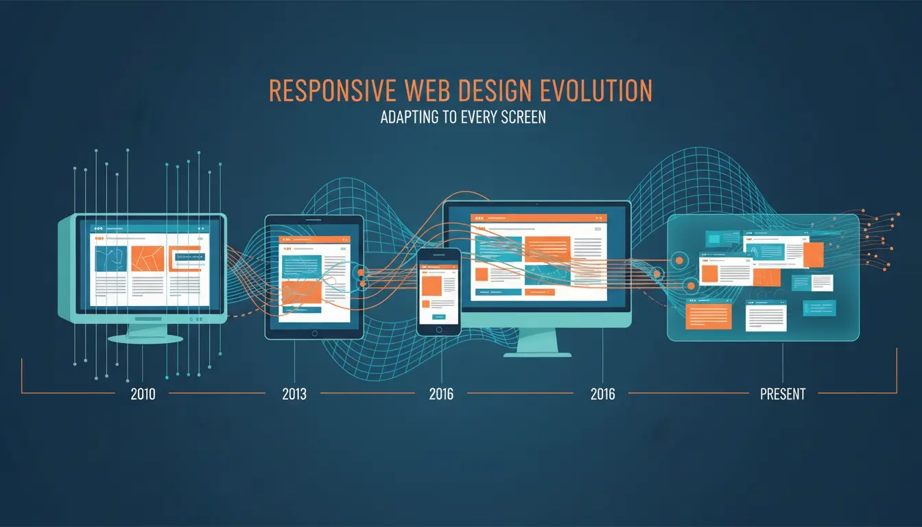
年表で見る、レスポンシブが常識になるまで
Marcotteの記事から実務の現場に定着するまで、およそ5年。そこからさらに「モバイルファースト」が当たり前になるまで、もう5年。この15年ほどの流れを整理してみます。
ピンチズームで「本物のWeb」を閲覧できるデバイスが登場。以後、画面サイズの多様化が加速していく。
SafariやFirefoxが先行してメディアクエリに対応。レスポンシブ誕生の技術的前提が整う。
A List Apartに掲載された記事で「Responsive Web Design」という語が初めて提唱される。
「小さい画面から設計を始めろ」というモバイルファースト思想が体系化される。レスポンシブと対になる原則として広まる。
A Book Apartから刊行。世界中のデザイナーの手元に「教科書」が届いた。
Twitter発のフレームワークが12カラムのレスポンシブグリッドを実装。レスポンシブは「書ける人」だけのものではなくなった。
俗に「モバイルゲドン」と呼ばれたアップデート。SEOの観点からも、レスポンシブ対応が事実上の必須要件になる。
Googleがクロール対象の基準をモバイル版に切り替え始める。PCサイトの「おまけ」としてのモバイルは、逆転して「本体」になった。
レスポンシブの実装技法そのものが、より柔軟なレイアウトシステムへと置き換わっていく。
「画面幅」ではなく「親要素の幅」に応じて変形するCSS。レスポンシブの思想は、コンポーネント時代に合わせて再び更新された。
「レスポンシブ」から「モバイルファースト」への思想的転換
Marcotteのオリジナルの提唱は、じつは「PCサイトを、小さい画面にも耐えられるように縮める」という発想に近いものでした。デスクトップの豊かなデザインを起点に、狭い画面で崩れないよう「リキッドに」組む。
この発想を逆転させたのが、2011年にLuke Wroblewskiが唱えたモバイルファーストです。彼の主張はシンプルでした。「小さい画面から設計しなさい。大きい画面はあとから足せばいい」。
PC向けの完成形を先に作り、max-width のメディアクエリで画面が狭くなったときの見え方を「追加」していく。起点は大きな画面。
小さな画面の制約から設計を始め、min-width のメディアクエリで大きな画面向けの要素を「足して」いく。起点は小さな画面、そして本質的な情報。
なぜこの順番がそこまで重要だったのか。理由は思想的なものです。狭い画面から設計を始めると、デザイナーは「本当に必要な情報は何か」を先に決めなければなりません。大きな画面から始めてしまうと、つい「余白があるから、ここにもバナーを足そう」という引き算の難しい設計になってしまう。
モバイルファーストは、画面サイズの話ではない。「何が本質で、何が装飾か」を問い直す、情報設計の話だった。
さらに時代の追い風がありました。2015年にGoogleが「モバイルフレンドリーかどうか」を検索順位のシグナルに組み込み、続いて検索クロールの主軸をモバイル版に切り替えていきます。ビジネス要件としても、モバイルファーストは無視できないものになりました。
いま、レスポンシブの先で起きていること
Ethan Marcotteの提唱から15年以上が経ちました。いま「レスポンシブデザイン」という言葉は、もはや議論の対象ですらありません。それは、HTMLの文書が左から右に流れるのと同じくらい、当たり前の前提になっています。
ただし、現場で起きている変化は続いています。
まず、メディアクエリからコンテナクエリへ。@media は「画面全体の幅」に応答する仕組みでしたが、コンポーネント指向が主流になった今、知りたいのは「このカードが置かれている場所の幅」です。CSS Container Queries(@container)は、まさにその問いに答える機能として登場しました。画面単位の応答から、コンポーネント単位の応答へ——思想は同じで、粒度が変わったのです。
もうひとつは、「画面幅」以外の応答軸。prefers-color-scheme でダークモードに応答し、prefers-reduced-motion でアニメーションの好みに応答する。レスポンシブの「応答する」という概念は、画面サイズを超えて、ユーザーのコンテキスト全般へと広がっています。
そして、CSS GridやFlexbox、clamp() のような関数の普及により、明示的なブレークポイントを設けずとも「自然にフレキシブルに伸縮するレイアウト」が書けるようになってきました。Marcotteがオリジナル記事で主張した「Webはもともとフレキシブルなメディアだ」という言葉に、CSSの実装がようやく追いついてきた、とも言えます。
レスポンシブデザインは、いわばWebというメディアの自己認識を変えた出来事でした。紙の延長でも、アプリの劣化版でもない。サイズも、文脈も、ユーザーも違う場所で、同じコンテンツが、そのつど最適な形で現れる。そんなメディアは、歴史上Web以外にありません。
次にCSSを書くとき、@media や clamp() を使う場面が来たら、少しだけ思い出してみてください。そのたった数行は、2010年に一本の記事が提起した「Webは本当はどうあるべきか」という問いの、直接の子孫なのです。ただ動けばいい、ではなく、どんな文脈にどう応答するかを選んでいる——その自覚だけで、書くコードの解像度は変わります。
まとめ
- 2010年以前のWebは、PCサイトと別URLのモバイルサイトを「作り分ける」のが一般的で、ひとつのHTMLが画面に応答するという発想自体がなかった。
- 2007年のiPhone登場以降、画面サイズの多様化が加速し、デバイスごとに別サイトを用意する戦略は破綻しつつあった。
- 2010年、Ethan Marcotteが A List Apart で「Responsive Web Design」を提唱。フルードグリッド・フルードイメージ・メディアクエリの3点で設計思想を整理した。
- 2011年のLuke Wroblewski『Mobile First』を経て、「小さい画面から設計を始める」という情報設計の原則が、レスポンシブの思想的な核になった。
- 2015年のGoogle「モバイルフレンドリー」アップデート以降、レスポンシブ対応は事実上の必須要件となり、PCサイトは「おまけ」から「派生形」へと立場を変えた。
- 現在はContainer Queriesや prefers-* 系メディア特性により、「応答する」対象が画面幅からコンポーネントやユーザーのコンテキストへと広がっている。