CSS Container Queries in Practice — Component-Level Responsive Design
Media queries can't see the box your component lives in. Container queries can. Here's how to use them in real projects, with patterns and live demos you can poke at.
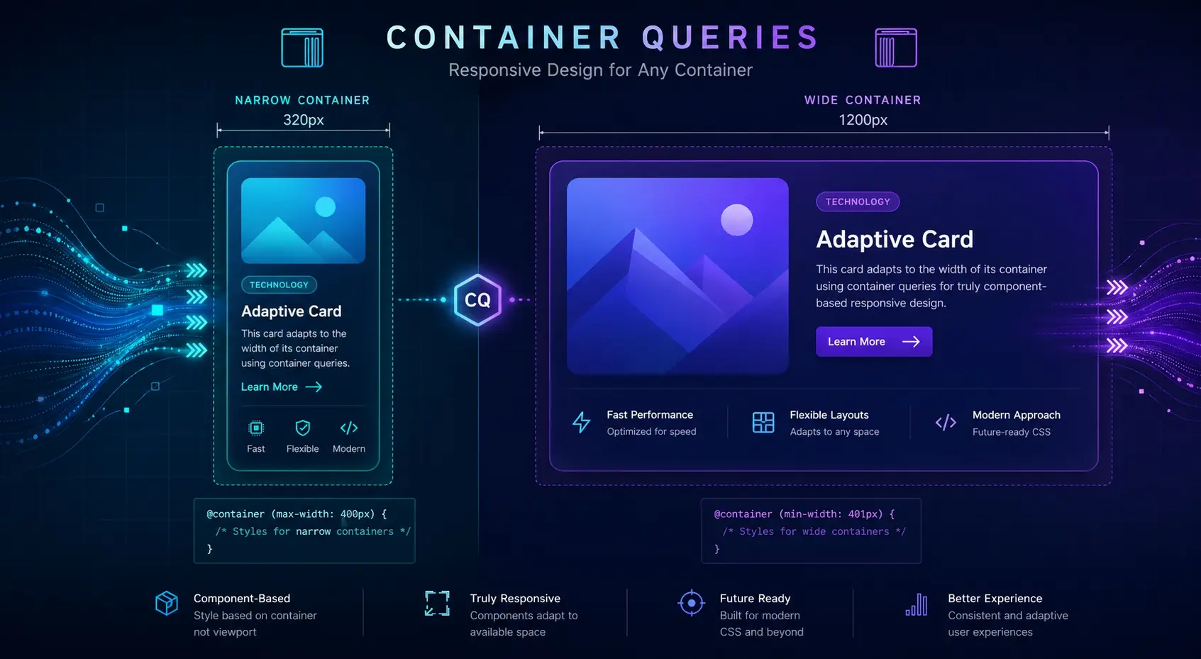
Why media queries aren't always enough
Here's a problem you've probably hit: a card component looks great in the main column, but the moment you drop it into a narrow sidebar, the layout falls apart. The screen is wide, but the spot the card lives in is narrow — and media queries can't tell the difference. They only know about the viewport.
That's exactly the gap container queries fill. Instead of asking "how wide is the screen?", a component asks "how wide is my parent?". It's a small shift in perspective, but it changes how you design responsive components from the ground up. The component starts to be aware of where it's placed, and adapts itself accordingly.
The minimum setup: declare a container, then query it
The mental model is straightforward once you've seen it. First, mark a parent element as a container. Then, write rules for its children using @container. That's the whole pattern.
/* 1. Declare the parent as a container */
.card {
  container-type: inline-size;
  container-name: card;
}

/* 2. Style the children based on the container's width */
@container card (min-width: 480px) {
  .card__inner {
    flex-direction: row;
  }
}
container-type: inline-size tells the browser, "track the inline (horizontal) size of this element so children can query it." The container-name is optional, but in real projects with nested containers, naming them saves you from a lot of confusion later.
Drag the bottom-right corner of the box below. Once it crosses 480px, the card switches to a horizontal layout — even though your screen size never changed.
A card that knows where it lives
This card responds to its parent's width, not the viewport. Whether it sits in the main column or a sidebar, it figures out the right shape on its own.
That demo is the whole idea in miniature. The viewport hasn't changed at all, but the card adapts because the box around it changed. Once you see this clicking in action, you stop thinking in screens and start thinking in components.
A real-world pattern: same card, different column counts
The place container queries pay off the most is grids of reusable cards. With pure media queries, you end up coupling the grid's column count to each card's internal layout — and that breaks the moment someone reuses the card somewhere else. The card gets dropped into a sidebar, and suddenly your "tablet" styles are kicking in even though there's no room for them.
/* This breaks the moment the card lands in a narrow column */
@media (min-width: 768px) {
  .card__inner { flex-direction: row; }
}.card { container-type: inline-size; }
@container (min-width: 480px) {
.card__inner { flex-direction: row; }
.card__title { font-size: 22px; }
}When the viewport is wide enough, these cards sit two-up. At that point, each card's own width drops below 480px — so they automatically fall back to the stacked layout. "Wider screen" doesn't always mean "wider card."
Card A
Two columns means each card is narrower, so it stacks. The card decides this on its own.
Card B
Same component, same CSS. Behavior depends entirely on where it's been placed.
Notice that there's only one set of card styles here. The page can put these cards anywhere — one column, two columns, sidebar, modal — and the card always picks the right shape. That's the kind of decoupling that makes design systems actually scalable.
Going further: scale typography with the cqi unit
Container queries also bring new units. The most useful one is cqi — one percent of the container's inline size. Think of it as vw, but scoped to the container instead of the viewport. It lets you scale things like font size smoothly based on where the component is placed.
.box {
  container-type: inline-size;
}
.box__title {
  /* min 18px, scales with 6% of container width, max 36px */
  font-size: clamp(18px, 6cqi, 36px);
}Resize the box below. The heading grows and shrinks based on the container's width, not the viewport's. The clamp() keeps it from going too small or too big.
A title sized by its container
That's cqi at work. Place this component anywhere and the typography scales naturally with the available space.
There are siblings — cqw (width), cqh (height), cqb (block), plus cqmin and cqmax — but honestly, in day-to-day work I reach for cqi almost every time. For horizontal-flow languages, cqi equals cqw, so starting with just that one unit covers most cases.
Adoption tips and browser support
Container queries went stable across all major browsers back in 2023. Chrome, Safari, Firefox, and Edge all support them today, so for most projects you can use them without a second thought. If you're stuck supporting older browsers, @supports gives you a clean way to layer the feature in.
/* Default: stacked layout — works even without container query support */
.card__inner { flex-direction: column; }

@supports (container-type: inline-size) {
  .card { container-type: inline-size; }

  @container (min-width: 480px) {
    .card__inner { flex-direction: row; }
  }
}
The other thing worth thinking about is which elements you actually mark as containers. If every component declares itself a container, you end up with a mess of overlapping query contexts and hard-to-trace bugs. A cleaner rule: only the outermost wrapper of a reusable component becomes a container. That keeps the system predictable.
Naming is the last piece. On a team, give your containers names that describe their role — card, media, sidebar, and so on. Anonymous containers work fine for small cases, but once you have nested components, named queries are much easier to read and reason about. Spend the extra few characters; future-you will thank you.
Takeaways
- Container queries let elements respond to their parent container's size instead of the viewport, making them ideal for component-level responsive design.
- The setup is two steps: add container-type: inline-size to the parent, then write @container (min-width: ...) rules for its children.
- The biggest payoff is reusable components — the same card can sit in a main column or a sidebar and adapt without page-specific overrides.
- Pair them with media queries: page-level layout uses media queries, internal component layout uses container queries.
- The cqi unit lets typography and spacing scale smoothly with the container's width, scoped to where the component lives.
- container-type creates a new containing context, so use it deliberately on the outermost wrapper of reusable components rather than scattering it everywhere.
- Browser support has been solid since 2023. For older targets, wrap the feature in @supports and ship the fallback as the default.