Design Customization ―
How to Tweak Your Site, Your Way
A field guide for taking the finished café SOEL site and shaping it into something that's truly yours. We'll swap colors, change fonts, add a dark mode, restructure the layout, and even add a second page — one practical recipe at a time.
Quick Recap
- Bonus 1 added CSS animations and prepared a fade-in-up class
- Bonus 2 brought it to life with JavaScript: hamburger menu, ARIA updates, scroll-triggered animations
- Across 10 main parts and 2 bonuses, café SOEL became a site that moves and communicates
Now that the foundation is solid, the rest is up to you. Maybe you'd like a different palette, a softer typeface, or a dark mode that's gentle on the eyes at night. This part is a collection of small recipes for those "I want to tweak this" moments.
Goals for This Part
- Recolor the entire site by editing only the CSS variables in :root
- Swap to a different Google Font and shift the whole tone of the site
- Add an OS-driven dark mode without writing any JavaScript
- Reshape the menu grid (3 columns, auto-responsive) and rework the gallery
- Add a second page — a menu detail page — and learn how multi-page sites stay consistent
The Customization Mindset — Don't Rewrite Everything at Once
Before we dive in, one thing I want to share. The most common mistake I see beginners make is editing CSS in fifty places at once. A few hours later, they can't remember what the original looked like, and rolling back becomes painful.
café SOEL was built with that risk in mind. By the end of Part 7, all the colors and fonts live as variables under :root. To recolor or restyle, you mostly only touch :root — nothing else. I always tell my team: "Customize from variables first." That single habit prevents a surprising amount of breakage.
The fewer places you touch, the better customization goes. Edit from variables, and you won't break the site.
Recipe 1 — Recolor the Entire Site
Color is the most visible part of an identity. Right now café SOEL leans warm beige and brown — natural, soft, and calm. To shift the mood entirely, you only need to rewrite the color block inside :root.
Option A — Forest Green & Gold (mature, evening café)
For a roaster or specialty coffee bar with an evening atmosphere. The wood warmth stays, but everything feels more refined.
:root {
  /* Replace only these. Don't touch anything else. */
  --color-bg: #fafaf7;
  --color-bg-soft: #f1efe9;
  --color-bg-accent: #e8e4dc;
  --color-text: #1f2a26;
  --color-text-light: #5a665f;
  --color-text-muted: #8a9690;
  --color-accent: #2d4a3e;       /* deep green */
  --color-accent-light: #c9a96e; /* gold */
  --color-border: #dcd8d0;
  --color-white: #ffffff;
  --color-black: #0f1816;
}
Option B — Pink Beige & Bordeaux (feminine pastry shop)
A softer, slightly sweet palette suited for a patisserie or a café aimed at a feminine audience.
:root {
  --color-bg: #fffaf7;
  --color-bg-soft: #faeee6;
  --color-bg-accent: #f3dccd;
  --color-text: #3a2a2a;
  --color-text-light: #7a5d5d;
  --color-text-muted: #b09494;
  --color-accent: #8b2d3a;       /* bordeaux */
  --color-accent-light: #d8a5a5; /* dusty pink */
  --color-border: #ecd9d0;
  --color-white: #ffffff;
  --color-black: #2a1a1a;
}
Option C — Mono & Vivid Orange (urban roastery)
Whites, blacks, and a single bold accent. Great for specialty coffee shops or design-led studios.
:root {
  --color-bg: #ffffff;
  --color-bg-soft: #f5f5f5;
  --color-bg-accent: #e8e8e8;
  --color-text: #1a1a1a;
  --color-text-light: #555555;
  --color-text-muted: #999999;
  --color-accent: #ff5722;       /* vivid orange */
  --color-accent-light: #ffab8a;
  --color-border: #dddddd;
  --color-white: #ffffff;
  --color-black: #000000;
}Recipe 2 — Swap the Fonts
After color, type is the next biggest lever. café SOEL uses Cormorant Garamond for display and Noto Sans JP for body. Swap those two and the whole "voice" of the site changes.
Step 1 — Pick a new pairing on Google Fonts
Visit Google Fonts and find a duo you like. If you're stuck, here are three pairings I reach for often.
Classic & elegant — Playfair Display × Noto Sans JP
An expressive serif that reads luxurious. Great for fashion, beauty, or a higher-end café feel. Body stays grounded with Noto Sans JP.
Modern & sharp — Inter × Noto Sans JP
Inter is a contemporary sans-serif that pairs perfectly with minimalist, design-led brands. Crisp and clean.
Handwritten & warm — Caveat × Zen Maru Gothic
For a chalkboard, hand-lettered feel. Best used for headlines and accents only — full body text in handwriting becomes hard to read.
Step 2 — Swap the link tag in HTML
Let's try Playfair Display + Noto Sans JP. Generate the embed code on Google Fonts and replace the existing font link in index.html.
<!-- Replace the existing Cormorant Garamond link with Playfair Display -->
<link rel="preconnect" href="https://fonts.googleapis.com">
<link rel="preconnect" href="https://fonts.gstatic.com" crossorigin>
<link href="https://fonts.googleapis.com/css2?family=Noto+Sans+JP:wght@400;600;700&family=Playfair+Display:wght@400;600;700&display=swap" rel="stylesheet">
Step 3 — Update the CSS variables
Then rewrite the font variables in :root. Every element using var(--font-display) updates automatically.
:root {
  /* Replace the existing font variables */
  --font-display: 'Playfair Display', Georgia, serif;
  --font-body: 'Noto Sans JP', -apple-system, sans-serif;
}Recipe 3 — Add Dark Mode
Looking at a café site at night, a bright white background can feel harsh. Let's make the site follow the OS dark-mode setting automatically — no JavaScript required, just one CSS media query.
The key is prefers-color-scheme, a media feature that lets you ask, "is the user requesting dark mode?"
/* ===== Bonus 3: Dark Mode ===== */
@media (prefers-color-scheme: dark) {
  :root {
    --color-bg: #1a1a1a;
    --color-bg-soft: #222222;
    --color-bg-accent: #2a2a2a;
    --color-text: #e8e4df;
    --color-text-light: #b0aca7;
    --color-text-muted: #7a7670;
    --color-accent: #c4a882;       /* lighter for contrast */
    --color-accent-light: #e8d2a8;
    --color-border: #333333;
    --color-white: #1a1a1a;       /* inverted */
    --color-black: #e8e4df;       /* inverted */
  }
}
That's it. Because café SOEL never hard-codes color values — every color goes through a variable — flipping the palette comes down to a single media query.
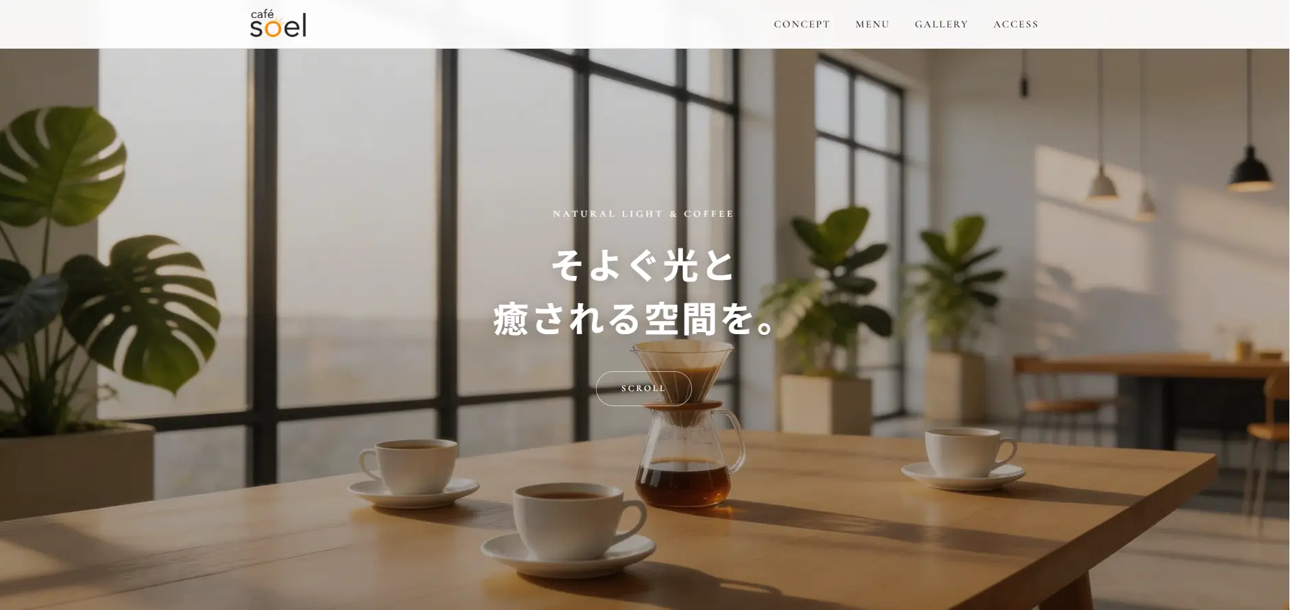
Concept
A quiet pause in shifting light. café SOEL is a calm space wrapped in natural light and the warmth of wood.
Concept
A quiet pause in shifting light. café SOEL is a calm space wrapped in natural light and the warmth of wood.
One more touch for images
Bright photos on a dark layout can feel a little loud. A subtle filter calms them down.
@media (prefers-color-scheme: dark) {
  .hero-image img,
  .gallery-item img,
  .menu-card-image img {
    filter: brightness(0.85);
  }

  /* If your logo is dark, invert it */
  .logo img {
    filter: brightness(0) invert(1);
  }
}Recipe 4 — Layout Variations
"What if I want three columns instead of two?" "What if my gallery should look more like a photo book?" Both are simple changes once you're comfortable with Grid.
Three-column menu
café SOEL ships with two columns. To switch to three, the only line that needs to change is grid-template-columns on .menu-grid.
.menu-grid {
  display: grid;
  /* From 2 columns to 3 */
  grid-template-columns: repeat(3, 1fr);
  gap: 24px;
  max-width: var(--container-width);
  margin: 0 auto;
}

@media (max-width: 900px) {
  .menu-grid {
    grid-template-columns: repeat(2, 1fr);
  }
}

@media (max-width: 600px) {
  .menu-grid {
    grid-template-columns: 1fr;
  }
}
Three on desktop, two on tablet, one on mobile. Once you can decide "how many columns at each breakpoint?" you can build almost any grid layout.
Auto-responsive grid
Here's a more advanced trick I use constantly in my own work. repeat(auto-fit, minmax(...)) lets the grid decide the column count based on available width — without writing any media queries.
.menu-grid {
  display: grid;
  /* Each column at least 260px wide; fit as many as possible */
  grid-template-columns: repeat(auto-fit, minmax(260px, 1fr));
  gap: 24px;
}
Even three-column gallery
The default gallery uses an asymmetric "one large, two small" layout. Switching to three even columns gives a quieter, more photo-book feel.
.gallery-grid {
  display: grid;
  grid-template-columns: repeat(3, 1fr);
  gap: 16px;
}

/* Reset the "large" item back to a single cell */
.gallery-item--large {
  grid-row: auto;
  grid-column: auto;
}

@media (max-width: 900px) {
  .gallery-grid {
    grid-template-columns: repeat(2, 1fr);
  }
}

@media (max-width: 600px) {
  .gallery-grid {
    grid-template-columns: 1fr;
  }
}Recipe 5 — Add a Second Page
So far we've stayed inside one page. As the site grows — a detailed menu, a news page, an "about" page — you'll need to add new HTML files. Let's build a menu detail page, menu.html, as an example.
Step 1 — Plan the file structure
my-website/
├── index.html        ← top page
├── menu.html         ← new menu detail page
├── css/
│   └── style.css     ← shared CSS
├── img/
│   └── ...
└── js/
    └── main.js
The important point: both pages load the same style.css. Sharing one stylesheet keeps the design consistent across the whole site and saves you from duplicating styles.
Step 2 — Create menu.html
Duplicate index.html, rename the copy to menu.html, and rewrite the body for the new page. The <head> structure carries over nicely.
<!DOCTYPE html>
<html lang="en">
<head>
  <meta charset="UTF-8">
  <meta name="viewport" content="width=device-width, initial-scale=1.0">
  <title>Menu — café SOEL</title>
  <meta name="description" content="Full menu detail page for café SOEL.">

  <!-- Reuse the shared CSS, fonts, and JS -->
  <link rel="icon" href="img/favicon.svg" type="image/svg+xml">
  <link rel="stylesheet" href="css/style.css">
  <script src="js/main.js" defer></script>
</head>
<body>

  <header class="header">
    <!-- Same header markup as index.html -->
  </header>

  <main>
    <section class="section">
      <div class="section-header">
        <span class="section-label">Menu Detail</span>
        <h1 class="section-heading">The Full Menu</h1>
        <p class="section-desc">A seasonally rotating selection — please enjoy.</p>
      </div>

      <!-- Place menu cards here -->
    </section>
  </main>

  <footer class="footer">
    <!-- Same footer as index.html -->
  </footer>

</body>
</html>
Step 3 — Update navigation links
Now the most important step: rewrite the navigation links on both pages so they jump to the right place.
<ul class="nav-list">
  <li><a href="#concept" class="nav-link">Concept</a></li>

  <!-- Was #menu (in-page anchor). Now points to a separate file -->
  <li><a href="menu.html" class="nav-link">Menu</a></li>

  <li><a href="#gallery" class="nav-link">Gallery</a></li>
  <li><a href="#access" class="nav-link">Access</a></li>
</ul>
From menu.html, jumping back to anchors on the top page uses the format filename#anchor.
<ul class="nav-list">
  <!-- Cross-page anchors use "filename#anchor" -->
  <li><a href="index.html#concept" class="nav-link">Concept</a></li>
  <li><a href="menu.html" class="nav-link">Menu</a></li>
  <li><a href="index.html#gallery" class="nav-link">Gallery</a></li>
  <li><a href="index.html#access" class="nav-link">Access</a></li>
</ul>
Step 4 — Add a breadcrumb for context
Once a site has more than one page, visitors need to know "where am I?" A simple breadcrumb does the job.
<nav class="breadcrumb" aria-label="Breadcrumb">
  <ol>
    <li><a href="index.html">Home</a></li>
    <li aria-current="page">Menu</li>
  </ol>
</nav>.breadcrumb {
max-width: var(--container-width);
margin: 0 auto;
padding: 100px var(--container-padding) 20px;
font-size: 13px;
color: var(--color-text-muted);
}
.breadcrumb ol {
display: flex;
gap: 8px;
}
.breadcrumb li:not(:last-child)::after {
content: '/';
margin-left: 8px;
color: var(--color-text-muted);
}
.breadcrumb a:hover {
color: var(--color-accent);
}Growing Your Site, One Step at a Time
What we covered are five common "I want to tweak this" moments — color, type, dark mode, layout, and adding a page. Mix and match these axes and café SOEL becomes something distinctly yours.
The key is not to chase perfection. Change just the colors first. Try a new font. Compare side by side. When I prepare design proposals, I usually start by laying out five color palettes next to each other before touching anything else. Small steps, often.
A site isn't finished when you ship it. It's something you grow. The more time you spend on it, the more it starts to look like you.
And one more thing. As you customize, things will go wrong. Layouts will break, colors will look off. That's not failure — that's the moment you learn the most. Treat the 10 main parts and 3 bonus parts as a map. When something gets confusing, come back and find your bearings. The map will be here.
One Last Word
That's a wrap on the "Build a Website from Scratch" series — 10 main parts and 3 bonus parts. Thank you for sticking with it.
From "Hello World!" in Part 1, through HTML, CSS, responsive design, SEO, accessibility, deployment, animation, JavaScript, and now customization. You're now someone who can build a website from zero, ship it to the world, and keep growing it from there.
Use café SOEL as a starting point — for your own café, your portfolio, a fan site for something you love. Wherever you take it, the next site is yours to shape. I'm looking forward to seeing more thoughtful sites out in the world.
See the final demo →
What You Learned
- Customize from variables first. Editing properties directly across the codebase makes it almost impossible to roll back
- Think of palettes in three layers — base, secondary, accent — to keep colors balanced
- Swap fonts by replacing the Google Fonts <link> and updating two CSS variables. The whole site updates at once
- @media (prefers-color-scheme: dark) delivers an OS-driven dark mode without any JavaScript
- Layout changes start and end with grid-template-columns. repeat(auto-fit, minmax(...)) gives you responsive grids without media queries
- For a second page, share one stylesheet, fix the navigation links, and give each page its own title and description
- A site is never really finished — it grows. Use this map you've built and keep shaping the site into something that's yours