Tailwind CSS Flex & Grid Utilities — Practical Layout Pattern Collection
You know how to slap a "flex" or "grid" class on a container — but when it comes time to build a real layout, the questions pile up: Flex or Grid? When do I use gap vs. margin? How do I stop cards from breaking on mobile? This guide cuts through the noise with copy-paste patterns you'll actually reach for in production.
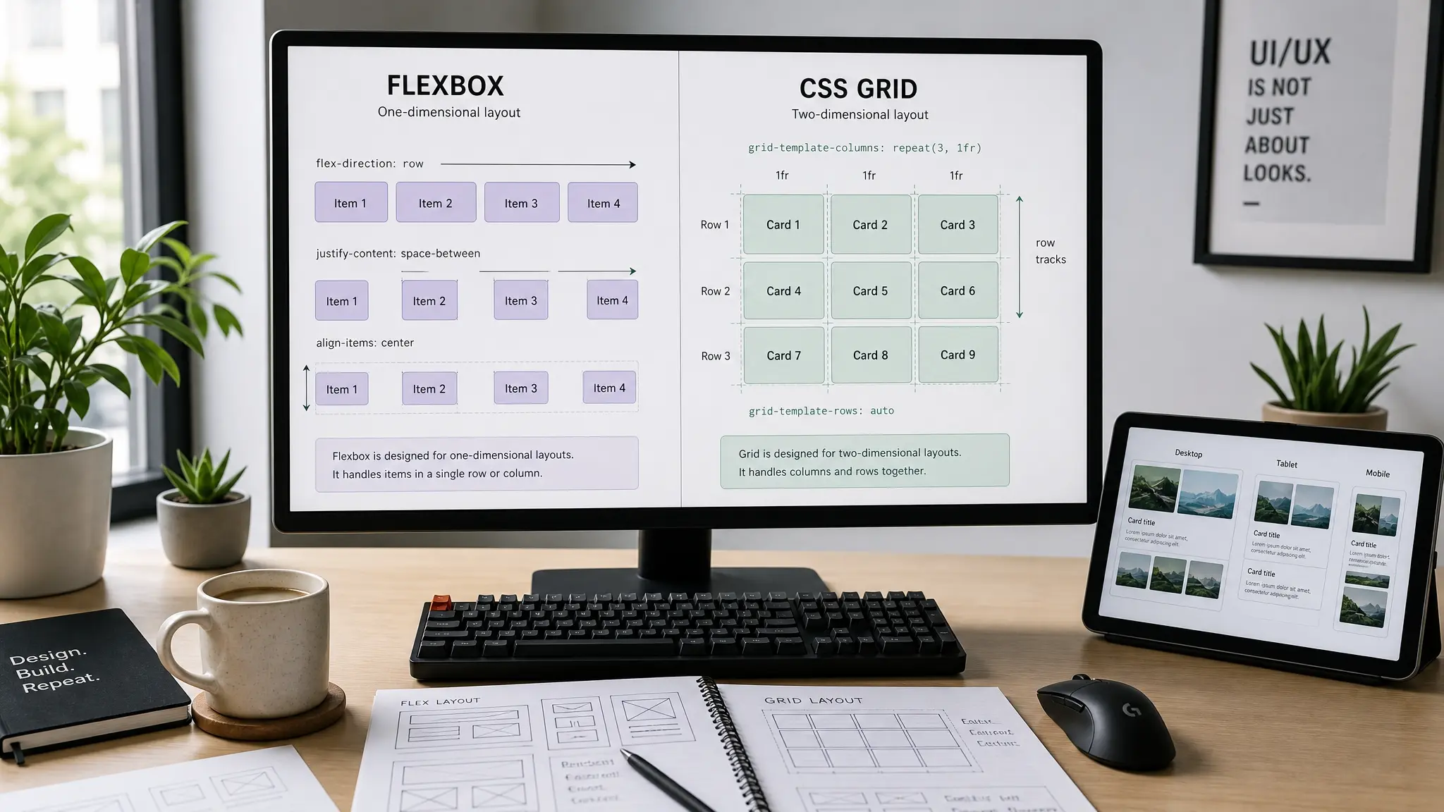
Flexbox vs. Grid — When to Reach for Which
Here's the mental model that finally made things click for me: Flexbox thinks in one dimension (a single row or a single column), while Grid thinks in two dimensions (rows and columns simultaneously). That single distinction drives every decision you'll make about which to pick.
Need to line up a logo on the left and nav links on the right? That's a one-dimensional problem — Flex. Need to lay out a card grid where every card occupies exactly one cell, and some span two columns? Two-dimensional — Grid. In practice, most pages use both: Grid for the macro structure, Flex for the micro details inside components.
A handy rule of thumb for the field: if the children's sizes are unpredictable (tags, nav links, buttons of varying width), go Flex. If you want every child locked into equal-width columns, go Grid. And when in doubt, start with Grid — you can always simplify later.
<!-- Flexbox: one-dimensional layout -->
<div class="flex items-center gap-4">
  <img class="w-10 h-10 rounded-full" />
  <span>Username</span>
</div>

<!-- Grid: two-dimensional layout -->
<div class="grid grid-cols-3 gap-6">
  <div>Card 1</div>
  <div>Card 2</div>
  <div>Card 3</div>
</div>FLEXBOX — items sized by content
GRID — equal-width columns
Flexbox Patterns — Navbars, Badges, and Centering
Let's start with the layouts that Flexbox handles best. These are one-dimensional problems where the children need to share a single axis intelligently.
Pattern 1: Header with Space-Between
The classic "logo left, nav right" header. In Tailwind, it's three utility classes: flex items-center justify-between. That's literally it.
<header class="flex items-center justify-between px-6 py-4">
  <a class="text-xl font-bold">Logo</a>
  <nav class="flex gap-6 text-sm">
    <a class="hover:text-cyan-600">Home</a>
    <a class="hover:text-cyan-600">About</a>
    <a class="hover:text-cyan-600">Contact</a>
  </nav>
</header>Pattern 2: Wrapping Tags / Badges
Tags, badges, filter chips — any time you have a variable number of items with unpredictable widths, flex flex-wrap gap-2 is your go-to. Grid would force equal widths on everything, which looks weird for short labels next to long ones.
<div class="flex flex-wrap gap-2">
  <span class="px-3 py-1 bg-cyan-100 text-cyan-800 text-xs font-medium rounded-full">
    Tailwind CSS
  </span>
  <span class="px-3 py-1 bg-cyan-100 text-cyan-800 text-xs font-medium rounded-full">
    Responsive
  </span>
  <span class="px-3 py-1 bg-cyan-100 text-cyan-800 text-xs font-medium rounded-full">
    Flexbox
  </span>
  <!-- Items wrap to the next line automatically -->
</div>Pattern 3: Perfect Centering
The eternal CSS problem — center something both horizontally and vertically. With Tailwind, it's either flex items-center justify-center (3 classes) or grid place-items-center (2 classes). Both work. Grid is one class shorter if all you need is centering.
<!-- Flexbox approach -->
<div class="flex items-center justify-center h-64">
  <p>Centered content</p>
</div>

<!-- Grid approach (one fewer class) -->
<div class="grid place-items-center h-64">
  <p>Also centered</p>
</div>Grid Patterns — Card Grids to Bento Layouts
CSS Grid really shines when you need to define the shape of a layout up front — "I want 3 equal columns" or "sidebar at 250px, main content takes the rest." In Tailwind v4, the grid-cols-<number> utility accepts any number dynamically — no config needed for grid-cols-7 or grid-cols-12.
Pattern 4: Responsive Card Grid
<div class="grid grid-cols-1 sm:grid-cols-2 lg:grid-cols-3 gap-6">
  <article class="bg-white rounded-xl p-6 shadow-sm">
    <h3 class="font-bold text-lg mb-2">Title</h3>
    <p class="text-gray-600 text-sm">Description...</p>
  </article>
  <!-- Repeat as needed -->
</div>Pattern 5: Sidebar + Main Content
The "fixed sidebar, fluid main" layout is everywhere — admin dashboards, documentation sites, blogs. With Grid, you declare the exact column widths in a single class using the arbitrary value syntax: grid-cols-[250px_1fr].
<div class="grid grid-cols-[250px_1fr] gap-8 min-h-screen">
  <aside class="bg-gray-900 text-white p-6">
    <nav class="flex flex-col gap-3">
      <a>Dashboard</a>
      <a>Projects</a>
      <a>Settings</a>
    </nav>
  </aside>
  <main class="p-8">Main content</main>
</div><div class="flex">
<aside class="w-[250px] flex-shrink-0">...</aside>
<main class="flex-1 min-w-0">...</main>
</div>
<!-- Forget flex-shrink-0 and the sidebar collapses -->
<!-- Forget min-w-0 and main content overflows --><div class="grid grid-cols-[250px_1fr] gap-8">
<aside>...</aside>
<main>...</main>
</div>
<!-- Column widths are explicit. No collapse, no overflow. -->Pattern 6: Bento Grid
The Apple-inspired Bento Grid — a mix of large featured cards and smaller ones — is all the rage. It's surprisingly simple with col-span-* and row-span-*.
<div class="grid grid-cols-4 grid-rows-3 gap-4">
  <div class="col-span-2 row-span-2 bg-cyan-600 rounded-2xl p-8">
    Feature
  </div>
  <div class="bg-gray-100 rounded-2xl p-6">Item A</div>
  <div class="bg-gray-100 rounded-2xl p-6">Item B</div>
  <div class="col-span-2 bg-gray-900 text-white rounded-2xl p-6">
    Wide Card
  </div>
  <div class="col-span-2 bg-gray-100 rounded-2xl p-6">Item C</div>
  <div class="col-span-2 bg-gray-100 rounded-2xl p-6">Item D</div>
</div>Combining Flex + Grid — Real-World Composite Patterns
In production code, you almost never use only Flex or only Grid on a page. They work best together — Grid for the macro layout, Flex for the micro component internals. Let's look at the pattern that comes up the most.
Pattern 7: Grid Outside, Flex Inside (Card Collection)
The outer container uses Grid to keep cards at equal widths. Each card internally uses Flex to push the "Read more" link to the bottom — regardless of how much text the card contains. The secret weapon: flex flex-col flex-1.
<div class="grid grid-cols-1 md:grid-cols-3 gap-6">
  <article class="flex flex-col bg-white rounded-xl shadow-sm overflow-hidden">
    <img class="w-full h-48 object-cover" src="..." />
    <div class="flex flex-col flex-1 p-6">
      <h3 class="font-bold text-lg mb-2">Title</h3>
      <p class="text-gray-600 text-sm flex-1">Body text...</p>
      <a class="mt-4 text-cyan-600 text-sm font-bold">Read more →</a>
    </div>
  </article>
</div>Pattern 8: Fluid Grid with auto-fit
What if you want the number of columns to adapt automatically — no breakpoints, no guessing? That's where auto-fit combined with minmax() comes in. You tell the browser: "Each card must be at least 250px wide, but can grow to fill remaining space."
<div class="grid grid-cols-[repeat(auto-fit,minmax(250px,1fr))] gap-6">
  <div class="bg-white rounded-xl p-6 shadow-sm">Card 1</div>
  <div class="bg-white rounded-xl p-6 shadow-sm">Card 2</div>
  <div class="bg-white rounded-xl p-6 shadow-sm">Card 3</div>
  <div class="bg-white rounded-xl p-6 shadow-sm">Card 4</div>
  <div class="bg-white rounded-xl p-6 shadow-sm">Card 5</div>
</div>Pattern 9: Subgrid for Aligned Card Rows
Tailwind CSS v4 supports grid-cols-subgrid and grid-rows-subgrid. This lets child items inherit their parent's grid track definitions. The killer use case: aligning title rows, body rows, and link rows across adjacent cards — without JavaScript.
<div class="grid grid-cols-3 gap-6">
  <article class="grid grid-rows-subgrid row-span-3 gap-2">
    <h3 class="font-bold">Even a long title aligns</h3>
    <p class="text-sm text-gray-600">Body text...</p>
    <a class="text-cyan-600 text-sm">Read more</a>
  </article>
  <!-- Other cards follow the same structure -->
</div>Short Title
Summary text here.
Read more →A Card With a Significantly Longer Title
Longer body too. Despite different heights, rows stay aligned with neighbors.
Read more →Medium
Subgrid shares track sizes across cards.
Read more →Common Mistakes and How to Fix Them
Even experienced devs trip over these. Let's go through the three most common "why isn't this working?" moments with Flex and Grid in Tailwind.
Mistake 1: flex-1 element overflows its container
<div class="flex">
  <div class="flex-1">
    <pre>A very long code block...</pre>
  </div>
</div>
<!-- The pre tag pushes past the parent width --><div class="flex">
<div class="flex-1 min-w-0">
<pre class="overflow-x-auto">A very long code block...</pre>
</div>
</div>
<!-- min-w-0 overrides the default min-width: auto -->Flex items have min-width: auto by default, which means they refuse to shrink below their content's intrinsic width. Adding min-w-0 tells the item: "It's okay to shrink to zero — I'll handle the overflow myself." Pair it with overflow-x-auto on the overflowing child for a scrollable area.
Mistake 2: Mixing gap with individual margins
<div class="flex gap-4">
  <div class="mr-4">A</div>  <!-- gap + mr-4 = double spacing -->
  <div>B</div>
</div><div class="flex gap-4">
<div>A</div>
<div>B</div>
</div>
<!-- Let gap handle all inter-item spacing -->The rule: inside Flex/Grid containers, use gap for spacing between children. Reserve margin for the container's relationship with its siblings — its outside. Mixing them creates math you don't want to debug at 11 PM.
Mistake 3: Card heights misaligned in Grid
Grid items stretch to fill their row by default. But if cards have varying text lengths, the internal content alignment breaks. Two solutions depending on complexity:
<!-- Approach 1: Flex + flex-1 (simpler) -->
<article class="flex flex-col">
  <p class="flex-1">Body (stretches)</p>
  <a>Read more (pinned to bottom)</a>
</article>

<!-- Approach 2: Subgrid (aligned across cards) -->
<article class="grid grid-rows-subgrid row-span-3">
  <h3>Title</h3>
  <p>Body</p>
  <a>Read more</a>
</article>Takeaways
- Flexbox handles one-dimensional layout (a single row/column); Grid handles two-dimensional layout (rows × columns). Use Flex for variable-width items, Grid for uniform columns.
- Navbars, tag clouds, and badge lists — anything with variable item counts and widths — belong to Flex + flex-wrap + gap.
- Sidebar layouts and Holy Grail patterns use Grid's arbitrary value syntax: grid-cols-[250px_1fr] gives you explicit, collapse-proof column definitions.
- Bento Grids combine col-span-* and row-span-* for mixed-size cards. Make them responsive with breakpoint-prefixed spans like lg:col-span-2.
- The "Grid outside, Flex inside" pattern is the production standard for card collections. Use flex-1 on the body text to push footer links to the bottom.
- auto-fit + minmax() creates fluid grids that adapt column count automatically — perfect for CMS sites where card counts change dynamically.
- Subgrid (grid-rows-subgrid + row-span-N) aligns internal card rows across siblings, solving the "title height mismatch" problem with pure CSS — no JavaScript needed.