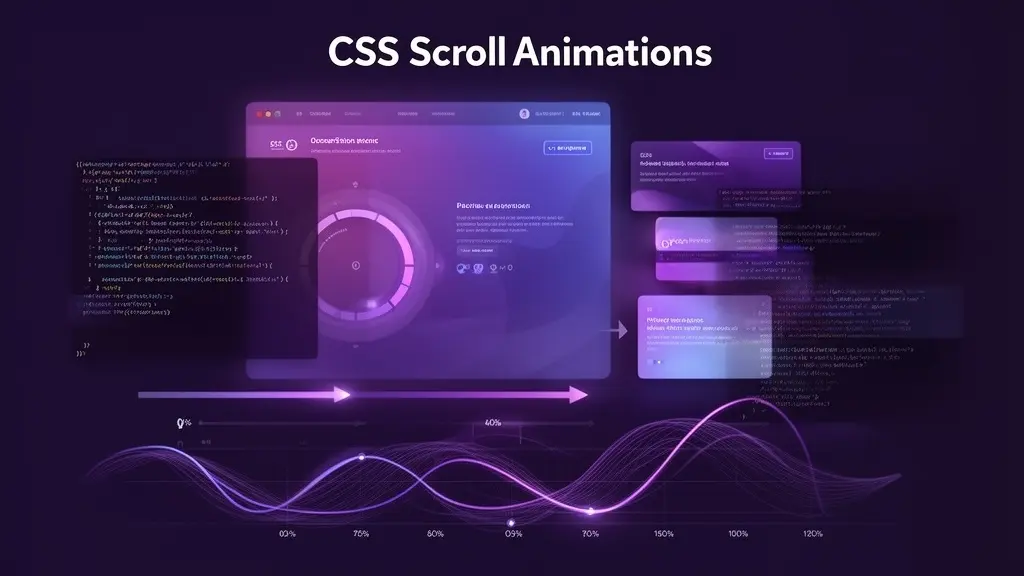
CSS Scroll-driven Animations — Scroll-linked Effects Without a Single Line of JS
Learn how to tie animations directly to scroll position using nothing but CSS. From progress bars to fade-ins to parallax — with working demos you can try right now.
Still wiring scroll listeners for every little animation?
"Fade elements in on scroll." "Show a reading-progress bar at the top of the page." These are some of the most common scroll-linked effects on the web, and until recently they all required JavaScript — a scroll event listener or an IntersectionObserver, paired with manual style updates on every frame. If you've ever wrestled with throttling, requestAnimationFrame synchronization, or normalizing scroll offsets across containers, you know how quickly the code sprawls out of control for what should be a simple visual flourish.
CSS Scroll-driven Animations change the game entirely. The idea is straightforward: instead of running a @keyframes animation on a time-based timeline (the default), you switch it to a scroll-based timeline. The animation's progress — from 0% to 100% — maps directly to the scroll position of a container or the visibility of an element inside a scrollport. Since you're reusing the same @keyframes you already know, the learning curve is just a handful of new properties.
There's a significant performance advantage, too. JavaScript scroll handlers run on the main thread, meaning heavy work can cause jank — that frustrating stutter when scrolling. CSS-based scroll animations, on the other hand, can be offloaded to the compositor thread, keeping the main thread free and delivering buttery-smooth 60fps+ even under load. In real projects, that means you can add rich scroll effects without the "beautiful animation but laggy scroll" trade-off.
Visualizing scroll progress with scroll()
The simplest entry point is animation-timeline: scroll(). It links an animation to the scroll progress of a scroll container. When the container is at the very top, the animation sits at its from keyframe. Scroll all the way to the bottom, and it reaches to. Everything in between is mapped proportionally. It's dead simple once you see it.
Minimal example: a reading progress bar
You've seen those thin bars at the top of blog posts that grow as you read. Here's the entire CSS it takes to build one with scroll-driven animations.
.progress-bar {
  position: fixed;
  top: 0;
  left: 0;
  width: 100%;
  height: 4px;
  background: linear-gradient(90deg, #7c3aed, #c4b5fd);
  transform-origin: left;
  animation: grow-bar linear;
  animation-timeline: scroll();
}

@keyframes grow-bar {
  from { transform: scaleX(0); }
  to   { transform: scaleX(1); }
}
Three things to notice here. First, animation-timeline: scroll() targets the nearest ancestor scroll container — usually the page itself. Second, we don't set an animation-duration because duration is irrelevant for scroll-driven animations (progress is driven by scroll position, not time). That said, setting it to 1ms explicitly is a common best practice for Firefox compatibility. Third, we animate transform: scaleX() instead of width because transforms stay on the compositor thread, making the bar buttery smooth even during fast scrolling.
Arguments of scroll()
The scroll() function accepts two optional arguments. The first specifies which scroller to track: nearest (the closest ancestor scroller — the default), root (the root element), or self (the element itself). The second specifies the scroll axis: block (default), inline, x, or y.
/* Page vertical scroll (default) */
animation-timeline: scroll();

/* Root element's scroll */
animation-timeline: scroll(root);

/* The element's own horizontal scroll */
animation-timeline: scroll(self inline);

/* Nearest ancestor, inline direction */
animation-timeline: scroll(nearest inline);Scroll inside the box below to watch the bar grow.
This is a demo of a scroll-driven progress bar. Scroll down to watch the bar at the top grow from left to right.
The bar is powered entirely by CSS. No JavaScript scroll listeners, no IntersectionObserver — just animation-timeline: scroll().
Under the hood, the browser maps your scroll offset (0% at the top, 100% at the bottom) directly to the @keyframes animation. The scaleX transform goes from 0 to 1 accordingly.
Because we're animating a transform property, the entire effect stays on the compositor thread. That means zero jank, even if the main thread is busy with other work.
Try scrolling back up. Notice how the bar shrinks in perfect sync with your scroll position. It's not a one-way trigger — it's a continuous, bidirectional mapping.
This is one of those patterns where the CSS-only version is both simpler to write and more performant than the JavaScript alternative. A genuine win-win.
Imagine this bar fixed to the top of an entire page — that's exactly how real-world reading progress indicators work with this technique.
You've reached the bottom. The bar should be fully extended!
Animating on visibility with view()
While scroll() ties an animation to the total scroll progress of a container, view() ties it to an element's visibility within a scrollport. The timeline starts when the element begins entering the visible area and ends when it completely leaves. Think of it as a built-in, CSS-native replacement for the IntersectionObserver + class-toggle pattern.
The classic "cards fade in as you scroll" effect — the one that used to require a JS library or a custom observer setup — now takes two lines of CSS.
.card {
  animation: fade-slide-in linear both;
  animation-timeline: view();
  animation-range: entry 0% entry 100%;
}

@keyframes fade-slide-in {
  from {
    opacity: 0;
    transform: translateY(40px);
  }
  to {
    opacity: 1;
    transform: translateY(0);
  }
}
Understanding animation-range
This is where the real control lives. With a view timeline, the element's visibility changes in stages — entering, fully contained, exiting — and animation-range lets you pin the animation to exactly the stage you want.
There are four range keywords: entry (from the moment the element starts appearing at the edge to when it's fully inside), exit (from when it starts leaving to when it's fully gone), contain (the period where the element is entirely within the scrollport), and cover (the entire duration while any part of the element is visible — the default). Each keyword can be combined with a percentage to fine-tune the start and end points.
/* Full entry: start entering → fully visible */
animation-range: entry 0% entry 100%;

/* Quick fade-in: just the first 30% of entry */
animation-range: entry 0% entry 30%;

/* Entire visible range (default = cover 0% cover 100%) */
animation-range: cover 0% cover 100%;

/* Fade out as the element exits */
animation-range: exit 0% exit 100%;
In my experience, entry 0% entry 100% is the go-to for most scroll-reveal effects. The animation starts as soon as the element peeks into view and finishes by the time it's fully visible. It feels natural — a gentle appearance rather than a sudden pop.
Scroll inside the box to watch cards fade in as they enter the viewport.
Patterns you can ship today
With the fundamentals in place, let's look at patterns you're likely to need in actual projects. We'll include a NG-vs-OK comparison so the reasoning behind each approach is clear.
Pattern 1: CSS-only parallax
Parallax — where a background element moves at a different speed than the foreground — is a staple of modern web design. With scroll(), you can achieve it by simply giving the background a smaller translateY range than the natural scroll distance.
// Blocks the main thread on every scroll tick
window.addEventListener('scroll', () => {
  const y = window.scrollY;
  bg.style.transform = `translateY(${y * 0.3}px)`;
});.parallax-bg {
animation: parallax-shift linear;
animation-timeline: scroll();
}
@keyframes parallax-shift {
from { transform: translateY(0); }
to { transform: translateY(-120px); }
}The JS version fires a style recalculation on the main thread with every single scroll tick. The CSS version runs entirely on the compositor thread, so it stays smooth no matter how fast the user scrolls. Simpler code and better performance — that's the kind of upgrade worth making.
Scroll to see the background circle move at a different speed than the text.
The foreground text scrolls at normal speed.
The purple circle behind it moves more slowly via CSS animation.
This speed difference creates the parallax effect.
Zero JavaScript. Pure CSS transforms on the compositor thread.
All driven by animation-timeline: scroll().
Try scrolling back up — it's fully bidirectional.
Smooth at any scroll speed, even on low-end devices.
Pattern 2: Staggered grid reveal
When you have a grid of cards, you often want them to fade in with a slight stagger as the user scrolls down. With view(), each card gets its own view timeline automatically — and since the cards are at different vertical positions, they naturally animate at different scroll offsets. No animation-delay needed.
.grid-item {
  animation: stagger-in linear both;
  animation-timeline: view(block);
  animation-range: entry 0% entry 100%;
}

@keyframes stagger-in {
  from {
    opacity: 0;
    transform: translateY(30px) scale(0.9);
  }
  to {
    opacity: 1;
    transform: translateY(0) scale(1);
  }
}
One thing to keep in mind: elements on the same row enter the viewport at the same time, so they'll animate simultaneously. If you want per-column staggering within the same row, you can give each column a slightly different animation-range offset. But honestly, in most real projects, the default behavior looks perfectly natural.
Scroll inside the box to reveal the card rows one at a time.
Pattern 3: Named timelines for cross-element control
Everything we've used so far — scroll() and view() — creates anonymous timelines. But sometimes you need to drive an animation on element B based on what's happening to element A. That's where named timelines come in.
/* Give the scroller a timeline name */
.scroller {
  scroll-timeline-name: --main-scroll;
  overflow-y: scroll;
}

/* Apply that timeline to a descendant */
.animated-child {
  animation: rotate-in linear;
  animation-timeline: --main-scroll;
}
You name a scroller with scroll-timeline-name using a --dashed-ident — the same naming convention as CSS custom properties. The animated element then references that name in its animation-timeline. Similarly, view-timeline-name lets you name a subject's visibility timeline and apply it to a different element. This is especially useful in complex layouts where the anonymous scroll(nearest) might pick up the wrong ancestor scroller.
Accessibility — respect prefers-reduced-motion
Scroll-linked animations are visually engaging, but for users with vestibular disorders, excessive motion can trigger dizziness, nausea, or disorientation. This is something to think about every time you add a scroll effect.
The fix is simple: use the prefers-reduced-motion: reduce media query to disable scroll-driven animations entirely.
@media (prefers-reduced-motion: reduce) {
  .card,
  .progress-bar,
  .parallax-bg {
    animation-timeline: none;
  }
}
Setting animation-timeline: none detaches the element from all timelines — including the default time-based one. It's more targeted than animation: none, which resets every animation property at once. Just make sure your reduced-motion selector has enough specificity to win over any animation shorthand declarations, since those reset animation-timeline to auto.
Scroll to see the box rotate and scale in. In a real project, this would be disabled for users who prefer reduced motion.
Fallback for unsupported browsers
For browsers that don't yet support scroll-driven animations — Firefox being the main one as of this writing — use @supports to gate the feature. The idea is to keep the default state fully visible and functional, then layer on the animation only where it's supported.
/* Default: fully visible, no animation */
.card {
  opacity: 1;
  transform: none;
}

/* Enhance only where supported */
@supports (animation-timeline: view()) {
  .card {
    animation: fade-slide-in linear both;
    animation-timeline: view();
    animation-range: entry 0% entry 100%;
  }
}
This progressive-enhancement approach is the safest path to production. Unsupported browsers simply show the content without animation — nothing breaks, nothing looks off. Supported browsers get the enhanced experience. That confidence in graceful degradation is exactly what makes it comfortable to adopt new CSS features in real client work.
Takeaways
- CSS Scroll-driven Animations let you link @keyframes animations to scroll position or element visibility — no JavaScript needed for scroll-linked effects
- The scroll() function maps an animation's progress to the scroll offset of a container (0% at top, 100% at bottom), perfect for progress bars and parallax
- The view() function ties an animation to an element's visibility within a scrollport, ideal for scroll-reveal fade-ins
- Use animation-range with keywords like entry, exit, contain, and cover to precisely control which phase of visibility drives the animation
- Always declare animation-timeline after any animation shorthand, since the shorthand resets timeline to auto
- Because these animations can run on the compositor thread, they're inherently more performant than JavaScript scroll-event approaches — no jank, no main-thread blocking
- Always pair scroll-driven animations with prefers-reduced-motion: reduce and use @supports to provide graceful fallback for unsupported browsers