CSS scroll-snap in Practice —
Carousel-Like UIs Without JavaScript
You don't need Swiper, Slick, or any JS library to make scroll positions snap into place. CSS scroll-snap gives you that satisfying "click-into-position" feel with just a few properties.
What Is scroll-snap?
Whenever I needed a carousel in the past, my first move was reaching for a JavaScript library. Swiper, Flickity, Slick — all solid tools. But for a lot of cases, what I actually wanted was simple: let the user scroll horizontally, and make items snap neatly into position. Loading 30KB+ of JavaScript for that always felt like overkill.
CSS scroll-snap solves exactly this problem. You tell the scroll container which direction to snap and how strictly, then mark each child element as a snap target. The browser handles all the physics — the deceleration, the touch momentum, the final snap animation. You write layout code, and the browser gives you native-feeling interaction for free.
Browser support is no longer a concern either. Every modern browser — Chrome, Firefox, Safari, Edge — has supported scroll-snap since 2019 at least. It's production-ready and has been for years.
The Two-Step Setup: Parent + Child
The mental model for scroll-snap is refreshingly simple. There are two properties to learn, and they go on two different elements.
Parent: scroll-snap-type
On the scroll container, you set scroll-snap-type. It takes a direction (x or y) and a strictness value (mandatory or proximity). mandatory means "always land on a snap point." proximity means "snap if you're close enough, otherwise keep going."
.scroll-container {
  overflow-x: auto;
  scroll-snap-type: x mandatory;
  display: flex;
  gap: 16px;
}
Child: scroll-snap-align
On each child, you set scroll-snap-align to define which edge should align with the container's snap position. The options are start (left/top edge), center, and end (right/bottom edge).
.scroll-item {
  scroll-snap-align: start;
  flex-shrink: 0;
  width: 280px;
}
That's it. Two properties, two elements. Let's see it in action.
← Scroll horizontally. Each item snaps to its left edge.
mandatory vs. proximity — When to Use Which
The first decision you'll face with scroll-snap is choosing between mandatory and proximity. The answer depends on what kind of UI you're building.
.container {
  scroll-snap-type: y mandatory;
  /* Always lands on a snap point */
  /* Even if the user tries to stop between items, it pulls them back */
}.container {
scroll-snap-type: x proximity;
/* Snaps if you're close to a point */
/* Fast flicks pass through freely */
}The key thing to remember: mandatory takes away scrolling freedom. For a landing page with one section per screen, that's exactly what you want. For a product carousel with twenty cards, it can feel frustrating — the user wants to quickly scan ahead, but the snap keeps pulling them back.
Top row (mandatory): always snaps to a card edge. Bottom row (proximity): a fast swipe flies right past.
Three Patterns You'll Actually Use
Pattern 1: Card Carousel with scroll-padding
Here's a scenario I run into all the time: the design has side margins on the page, but the carousel should bleed edge-to-edge while still snapping with an offset. The solution is scroll-padding. It shifts the snap alignment point inward without affecting the layout of the children.
.carousel {
  overflow-x: auto;
  scroll-snap-type: x mandatory;
  scroll-padding-left: 24px;
  display: flex;
  gap: 16px;
  padding: 0 24px;
}

.carousel-card {
  scroll-snap-align: start;
  flex-shrink: 0;
  width: 280px;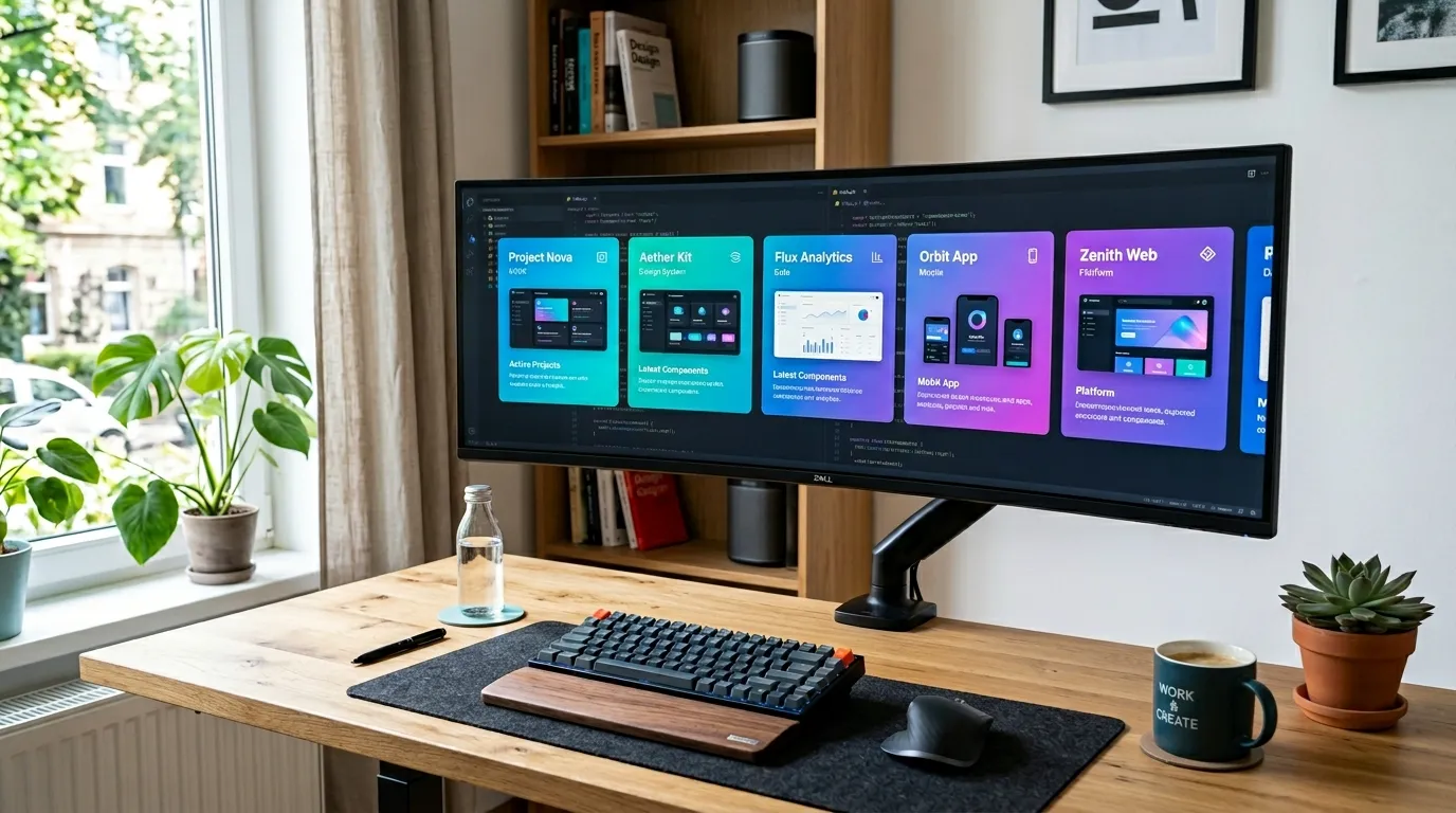
}Project Alpha
Pure CSS carousel. The left offset is controlled by scroll-padding.
Project Beta
Responsive adjustments only require changing the card width.
Project Gamma
Zero JavaScript dependencies. Dramatically lower maintenance cost.
Project Delta
Smooth native scrolling on touch devices — no polyfills needed.
Project Echo
Perfect for image galleries, portfolios, and product listings.
Notice the 24px left offset. Cards snap at that offset, not at the container edge.
Pattern 2: Full-Screen Vertical Scroll
Landing pages and presentation-style sites that advance one screen at a time used to require libraries like fullPage.js. With scroll-snap, the CSS is almost trivially simple.
.fullpage {
  height: 100vh;
  overflow-y: auto;
  scroll-snap-type: y mandatory;
}

.fullpage-section {
  height: 100vh;
  scroll-snap-align: start;
  display: flex;
  align-items: center;
  justify-content: center;
}This demo uses a 300px container. In production, you'd use height: 100vh for true full-screen.
Pattern 3: Center Snap for Focus UIs
scroll-snap-align: center keeps the selected item centered in the viewport. It's perfect for image galleries or picker-style UIs where you want to highlight the current selection.
.gallery {
  overflow-x: auto;
  scroll-snap-type: x mandatory;
  display: flex;
  gap: 12px;
  padding: 0 calc(50% - 100px);
  /* Ensures first/last items can also reach center */
}

.gallery-item {
  scroll-snap-align: center;
  flex-shrink: 0;
  width: 200px;
}Items always snap to center. The padding trick ensures even the first and last items can reach center position.
Preventing Skip-Ahead with scroll-snap-stop
Even with mandatory, a fast flick can skip over multiple snap points. If you need every single item to be seen — think onboarding steps or a tutorial — add scroll-snap-stop: always to the children.
.card {
  scroll-snap-align: start;
  scroll-snap-stop: always;
  /* Even a fast flick stops at each card */
}
Use this sparingly. scroll-snap-stop: always severely limits the user's ability to browse quickly. It makes sense for onboarding flows or legal-disclosure screens. For a product carousel? Your users will feel trapped.
Responsive Design and Accessibility
Making scroll-snap responsive is straightforward. Set card widths in viewport units or percentages, and the snap behavior naturally adapts. For a common pattern — single card on mobile, three across on desktop — you'd write something like this:
.card {
  scroll-snap-align: start;
  flex-shrink: 0;
  width: 85vw;  /* Mobile: near full-width */
}

@media (min-width: 768px) {
  .card {
    width: calc(33.333% - 12px);  /* Desktop: 3 columns */
  }
}
On the accessibility side, scroll-snap works with keyboard navigation (Tab + arrow keys) out of the box. To make the experience clear for screen reader users, add tabindex="0", role="region", and aria-label to the scroll container.
<div
  class="carousel"
  role="region"
  aria-label="Project gallery"
  tabindex="0"
>
  <!-- cards -->
</div>
Takeaways
- scroll-snap requires just two steps: scroll-snap-type on the parent, scroll-snap-align on the children
- mandatory always snaps; proximity snaps only when close — test on mobile to decide which feels right
- scroll-padding shifts the snap alignment point without changing the layout — perfect for offset carousels
- scroll-snap-align: center creates focus UIs where the active item is always centered
- scroll-snap-stop: always prevents skip-ahead but limits user freedom — use it only where skipping would be a problem
- Responsive behavior comes from setting card widths in vw or %, and scroll-snap adapts automatically
- Add role="region" and aria-label to ensure your scroll containers are accessible to screen readers